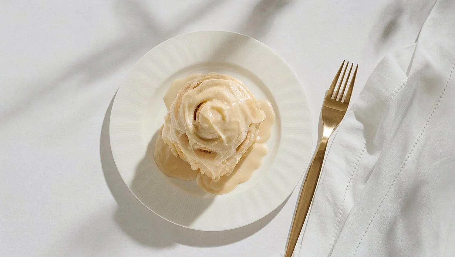
Louie and Honey’s Kitchen
TURNING AMISH DUTCH TRADITION INTO A FRENCH-INSPIRED DESTINATION
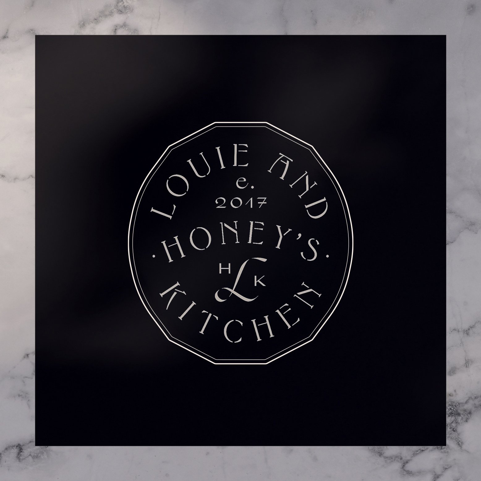
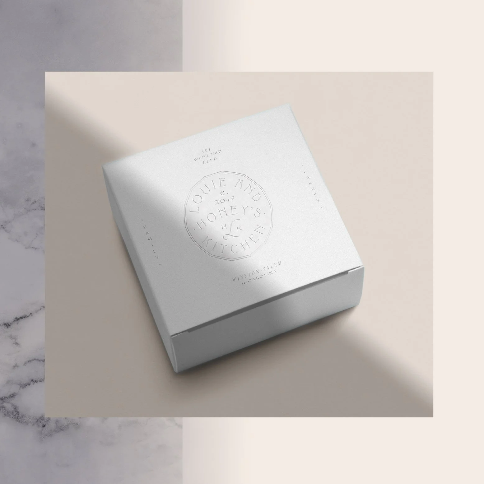
Louie and Honey’s Kitchen is a mother–daughter bakery rooted in Amish Dutch tradition and shaped by a French-inspired sense of craft and warmth. As they evolved from a beloved popup into a true brick-and-mortar destination, the brand needed a presence that felt as considered as their baking. This project introduced a comprehensive identity system—logo, packaging for retail coffee and baked goods, merch, and web—designed to give the new store a clear visual voice while preserving the homemade, heritage-driven charm that made them local favorites in the first place.
VID LOOP OF TEASER CAMPAIGN AND PRODUCT SHOTS HERE. VIBE ENERGY
The Creative Direction
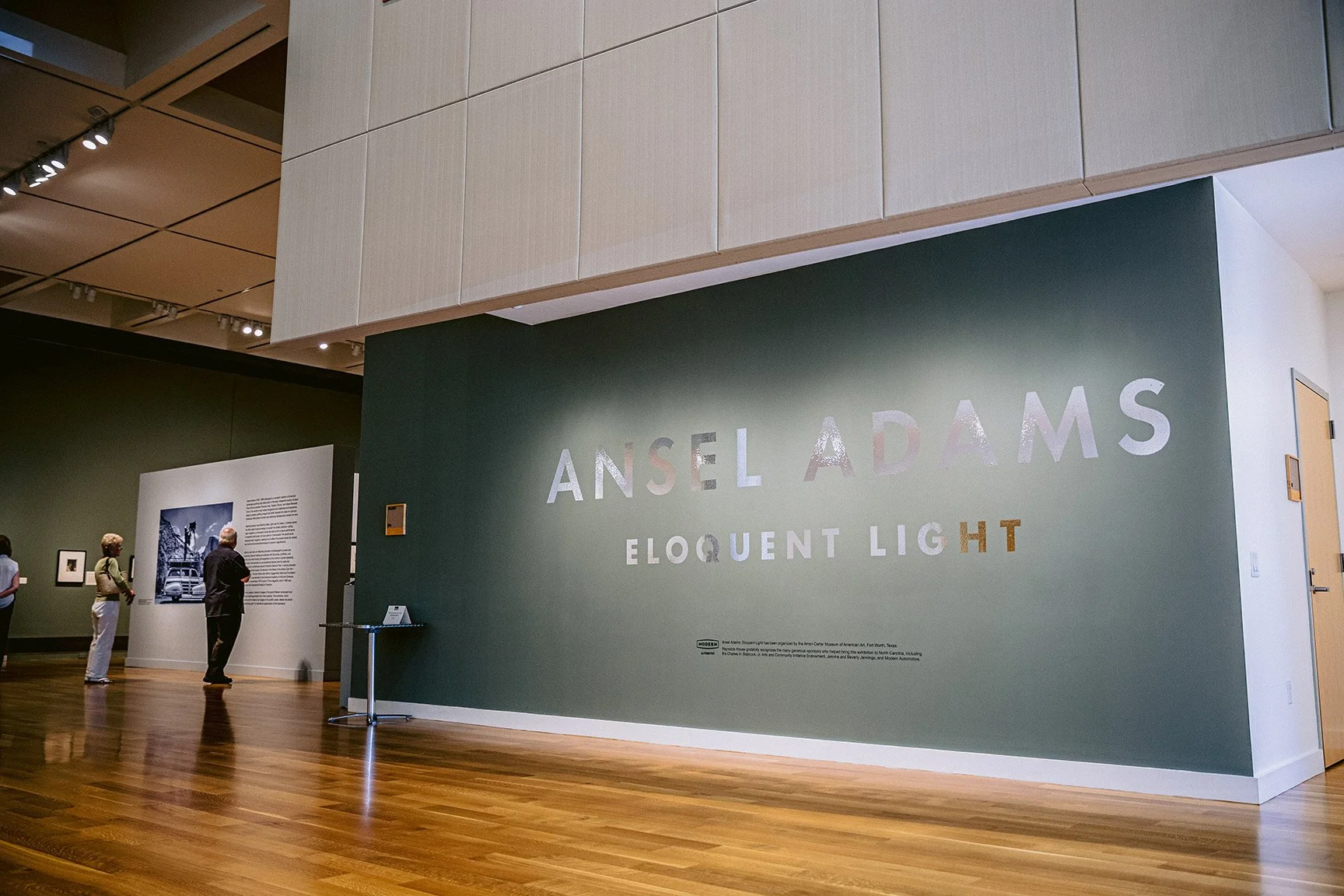
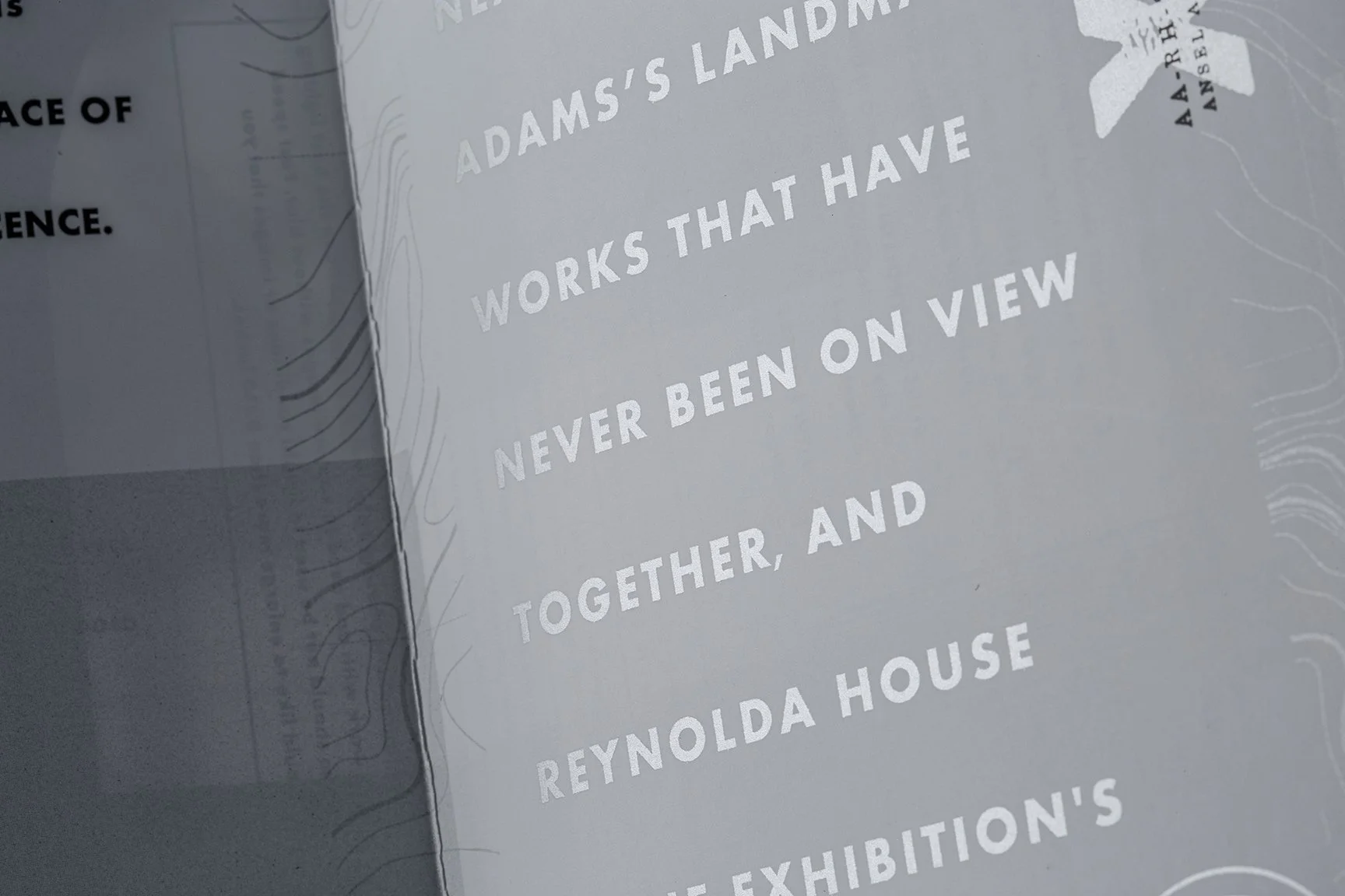
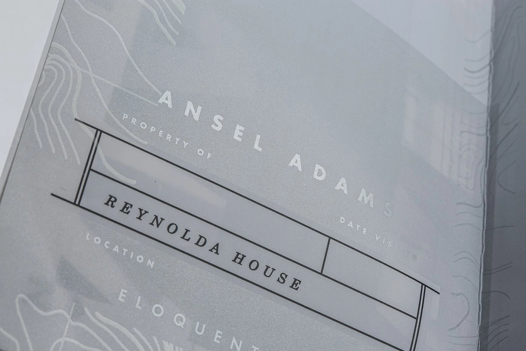
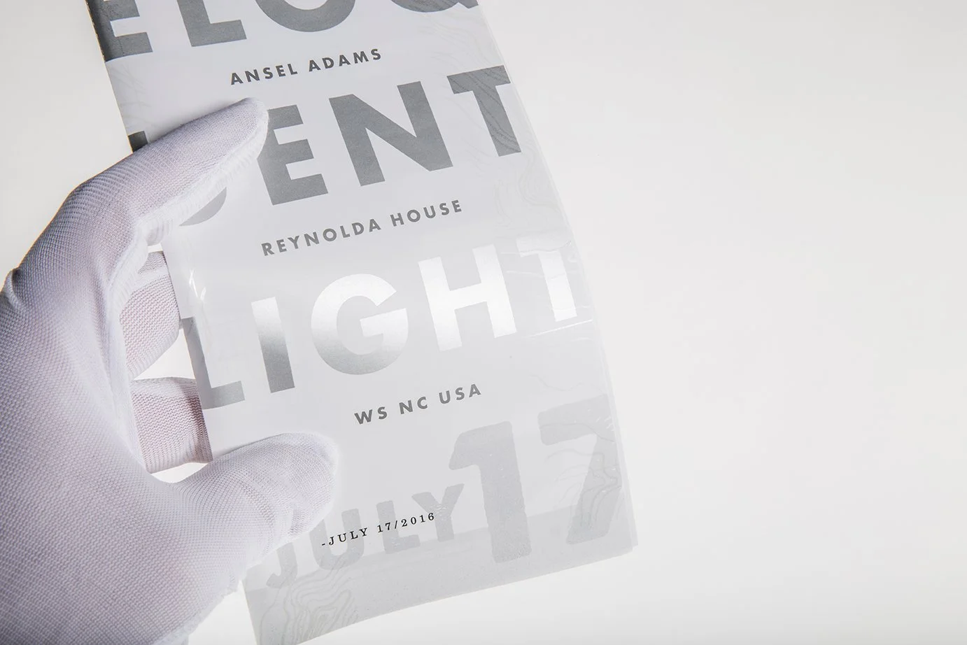
The design system was built from three interlocking ideas: era, craft, and light. Typography was drawn from the visual language of Adams' most active years — letterforms found on vintage film boxes and field journals, placing the audience in his world before they ever stepped inside the exhibition. Color held to black and white, finding richness not through hue but through material and surface.
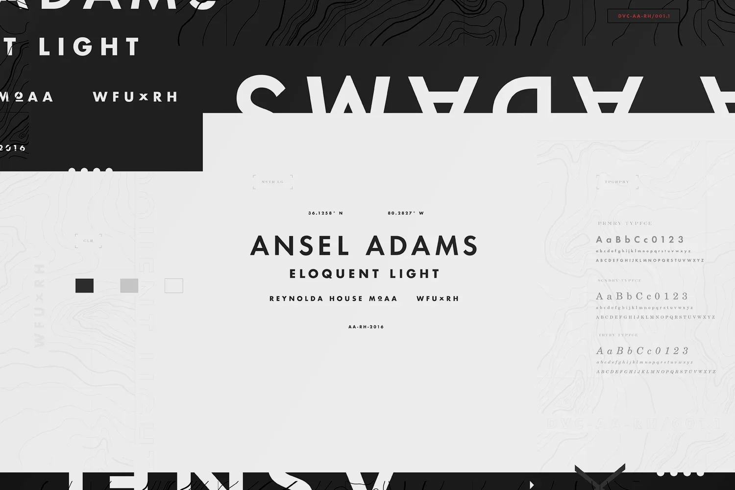
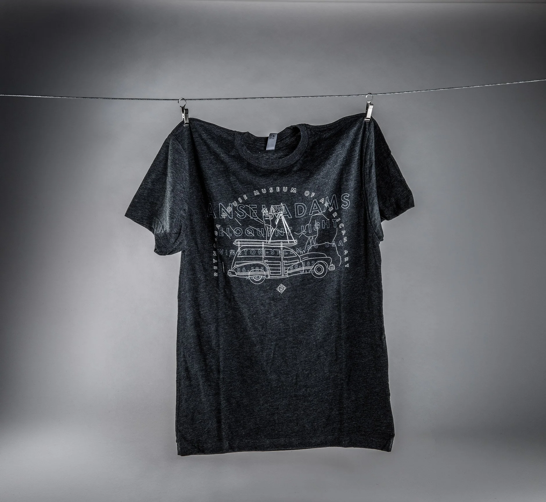
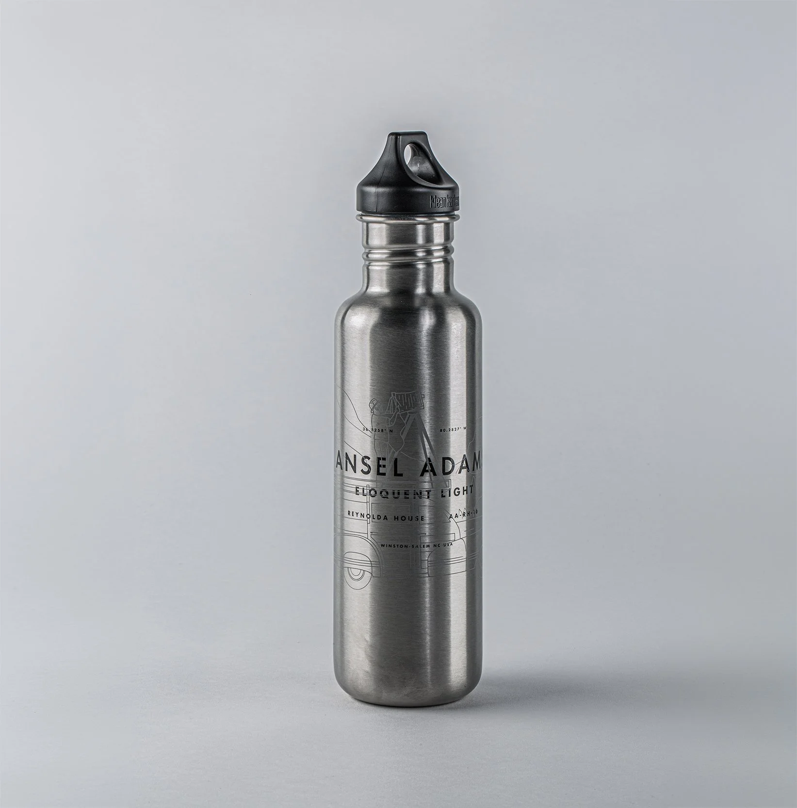
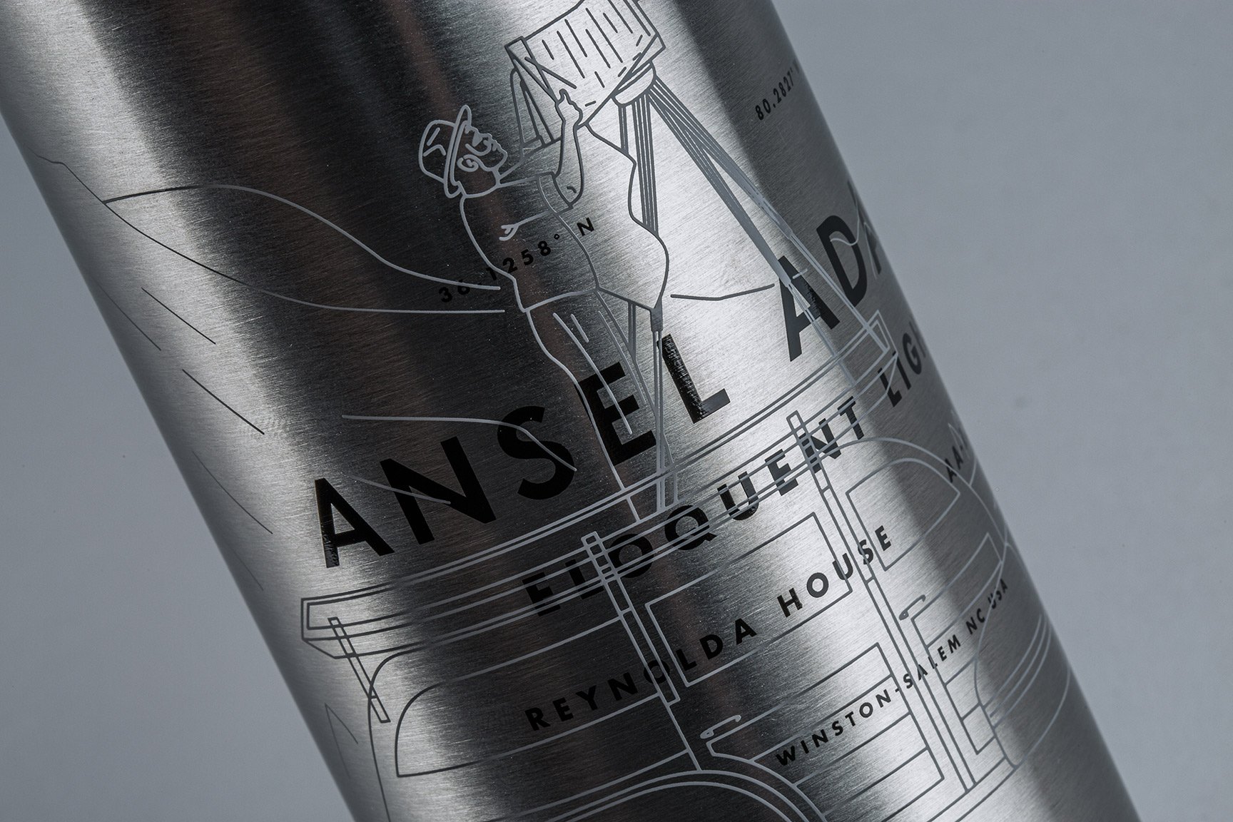
A topographical illustration style became the visual signature — complex enough to carry the work, grounded enough in landscape to honor Adams' legacy. At its core: a topographical rendering of Adams himself atop his car. A re-interpretation of one of his most famous photographs of himself.
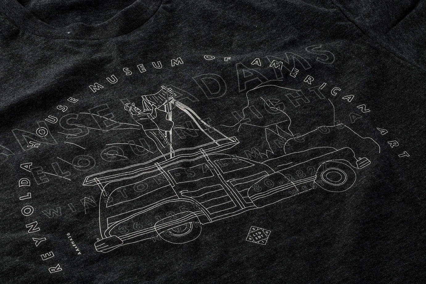
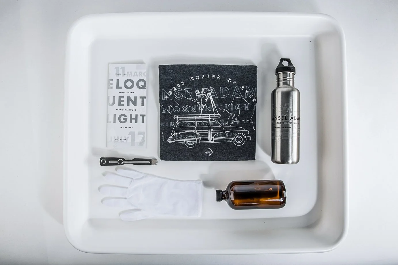
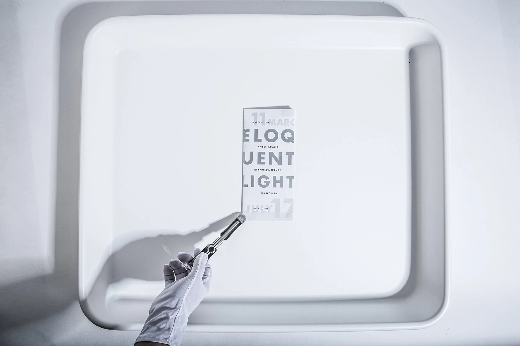
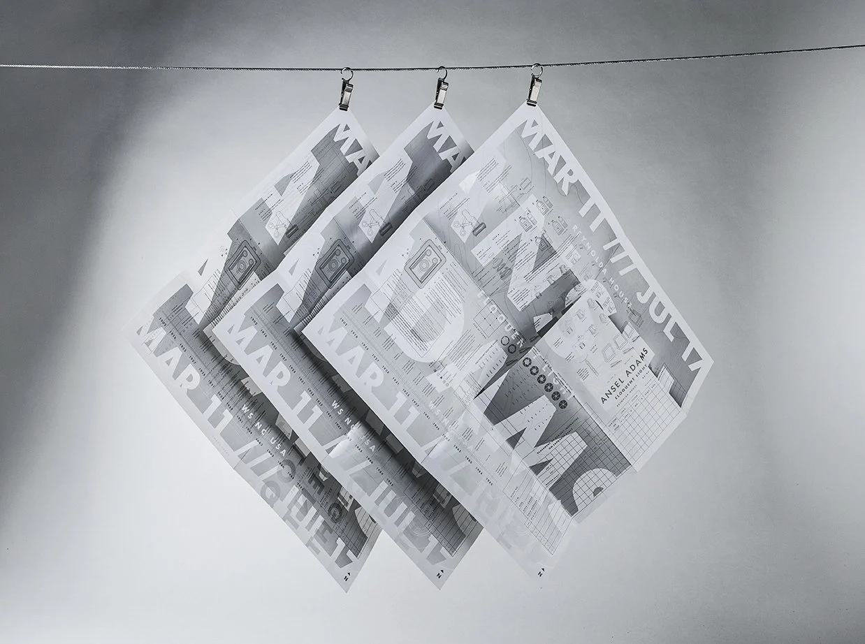
The concept went beyond theme — light became a literal design element. The printed brochure folded out into a full poster where the topographical illustration was applied in a clear gloss varnish across the entire surface. In flat light, it disappeared. As the angle shifted, Adams emerged from the page. The exhibition title Eloquent Light stopped being just a name — it became the physical experience of holding the piece.
Woven throughout the identity were illustrations drawn from the darkroom process — aperture blades, developing chemicals, photographic diagrams — quiet details that rewarded curiosity without demanding it.
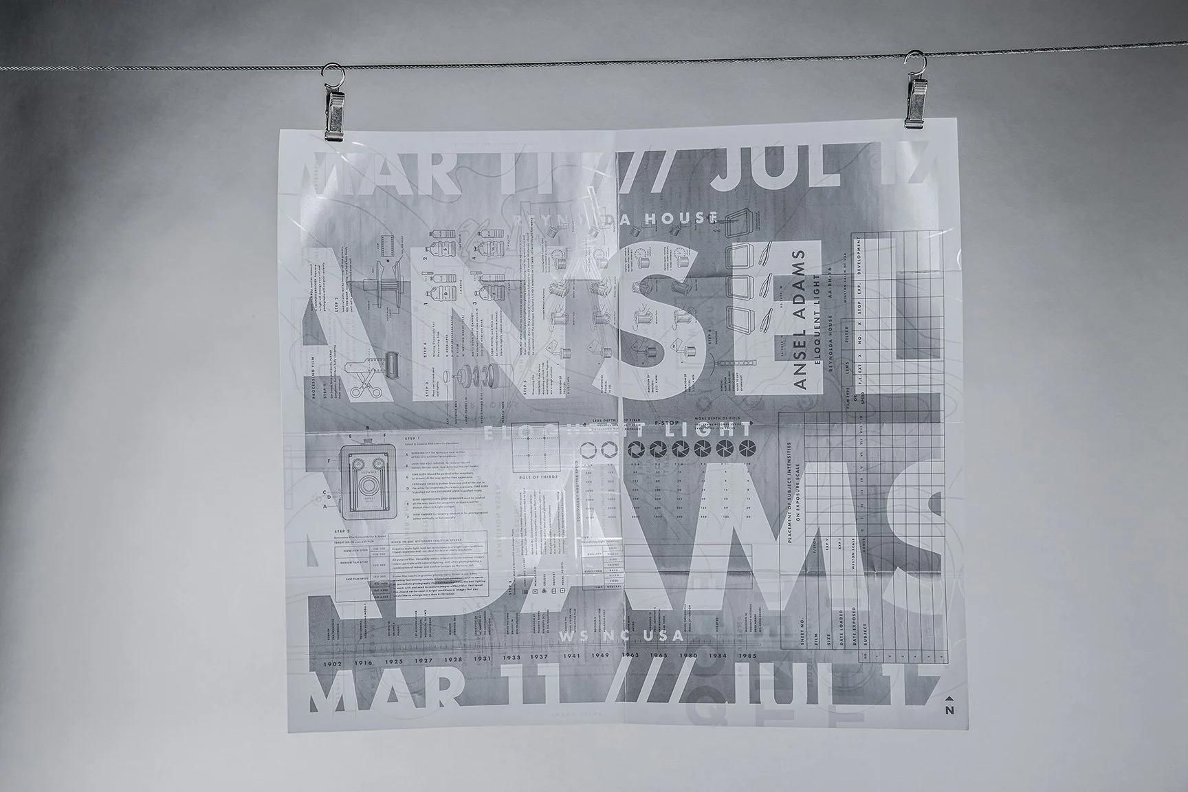
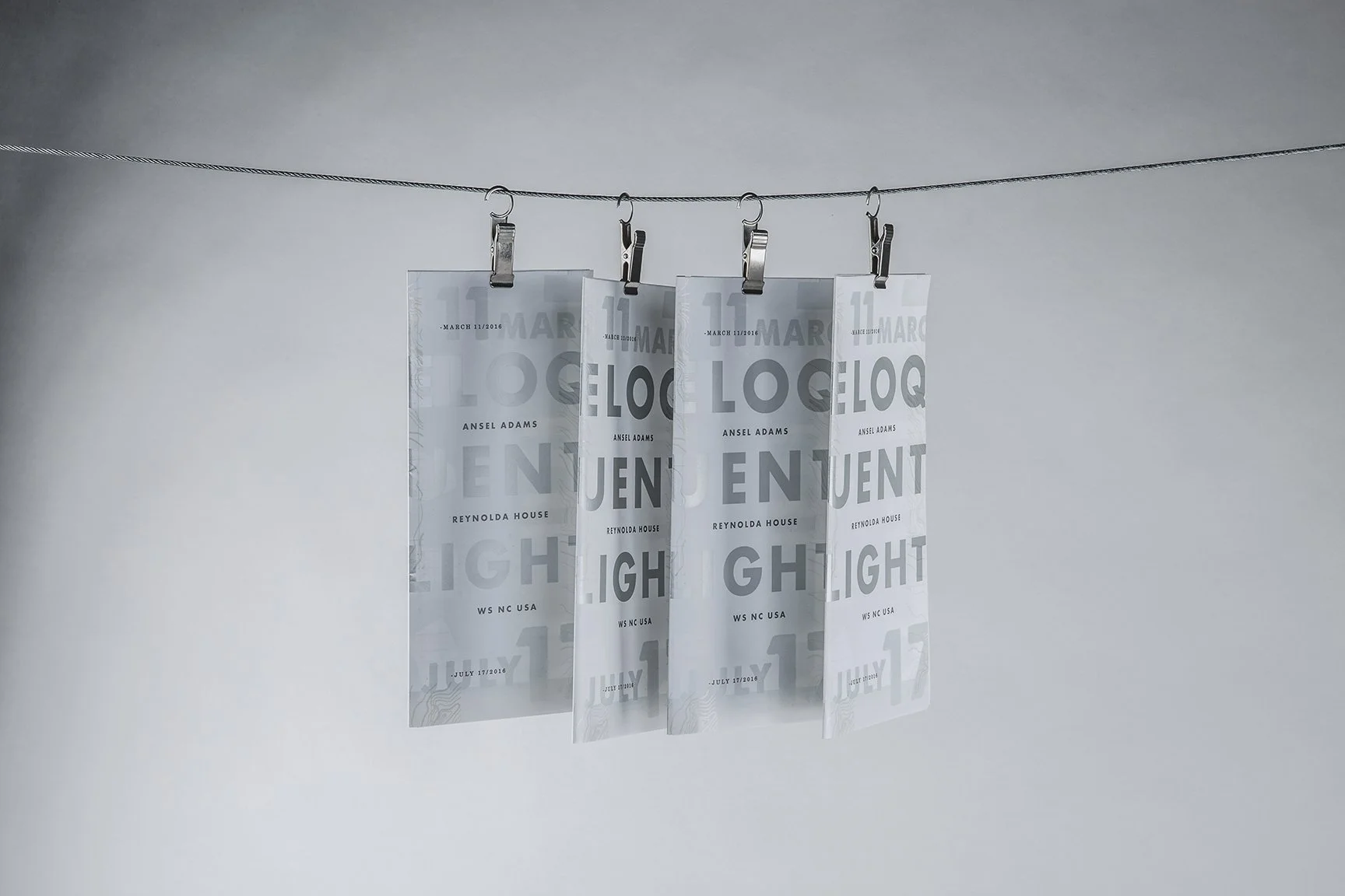
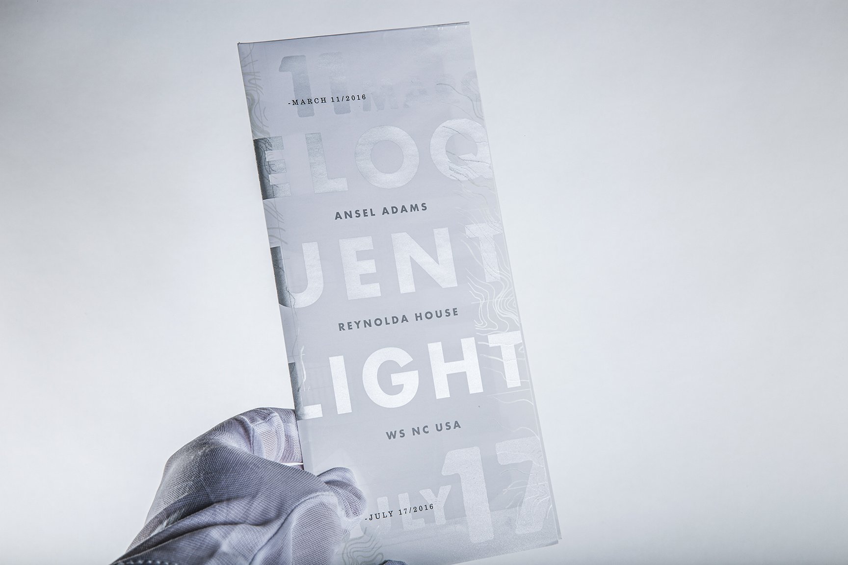
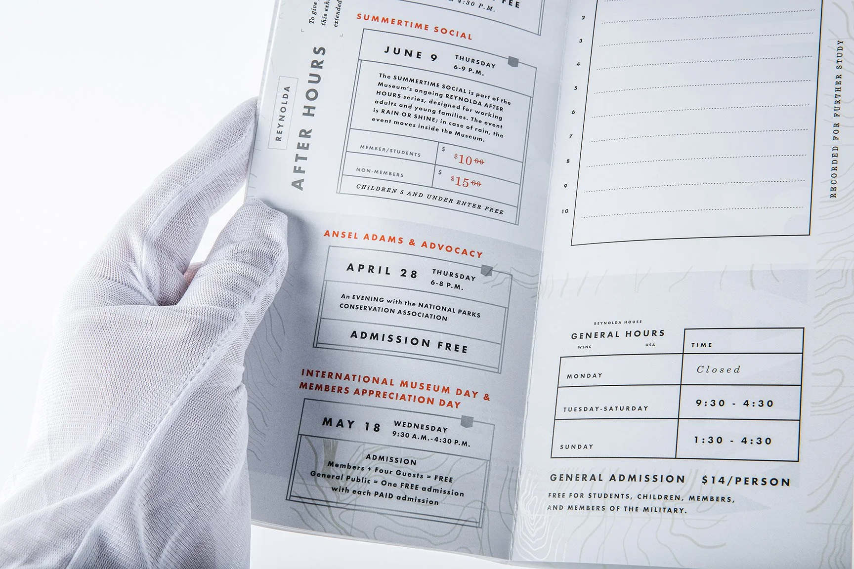
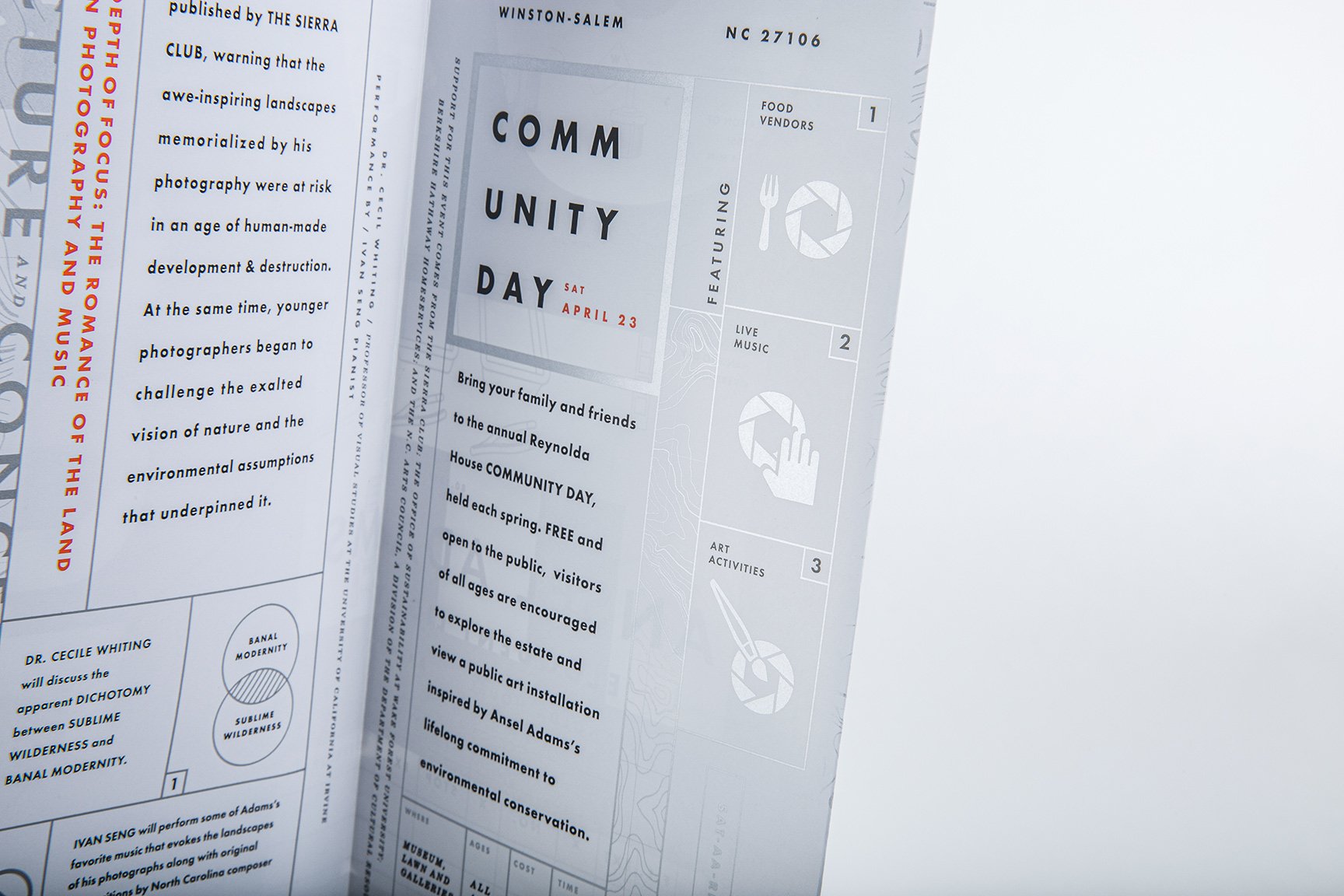
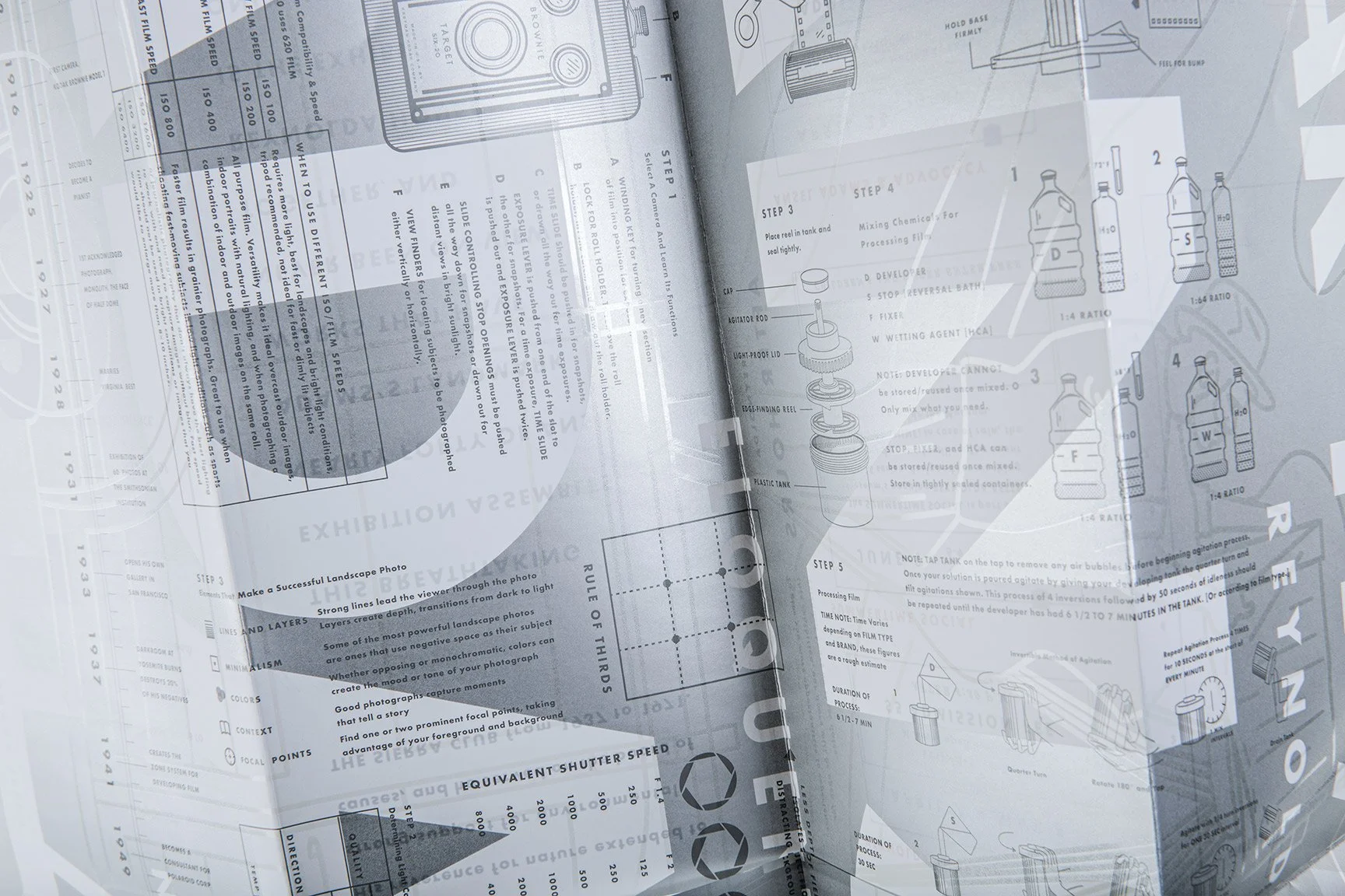
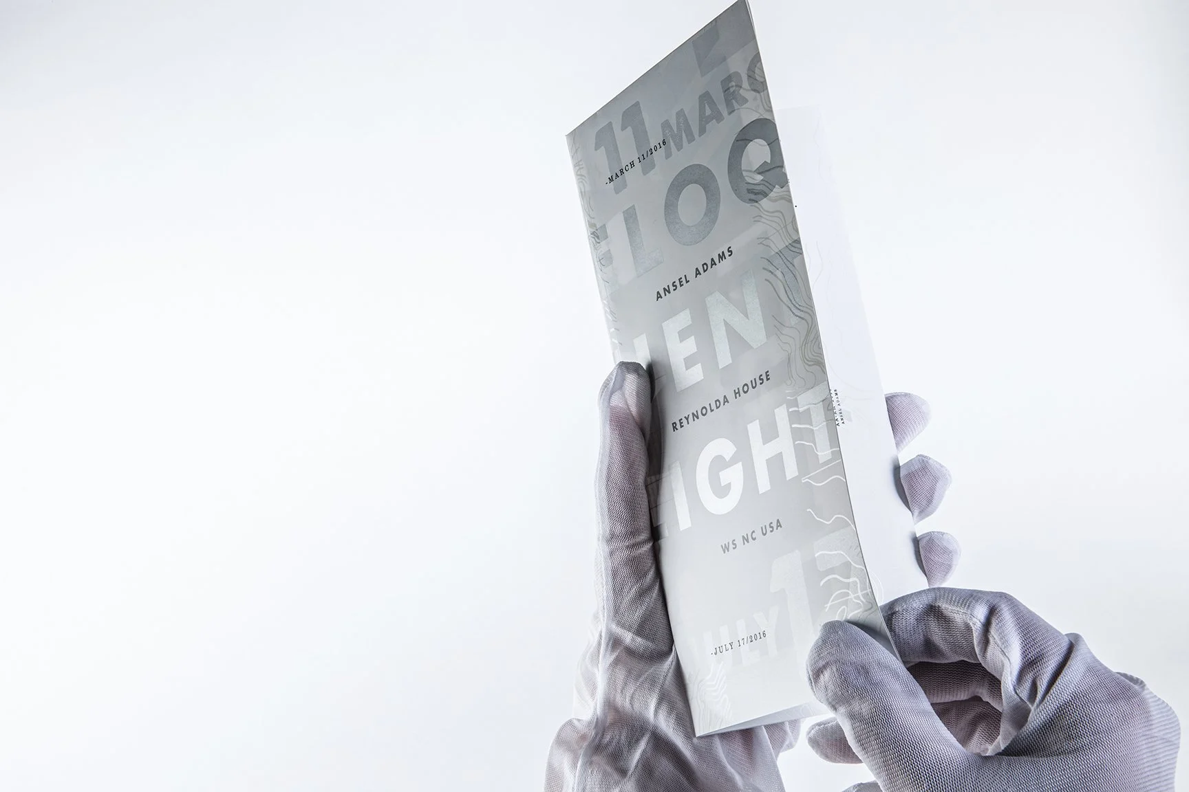
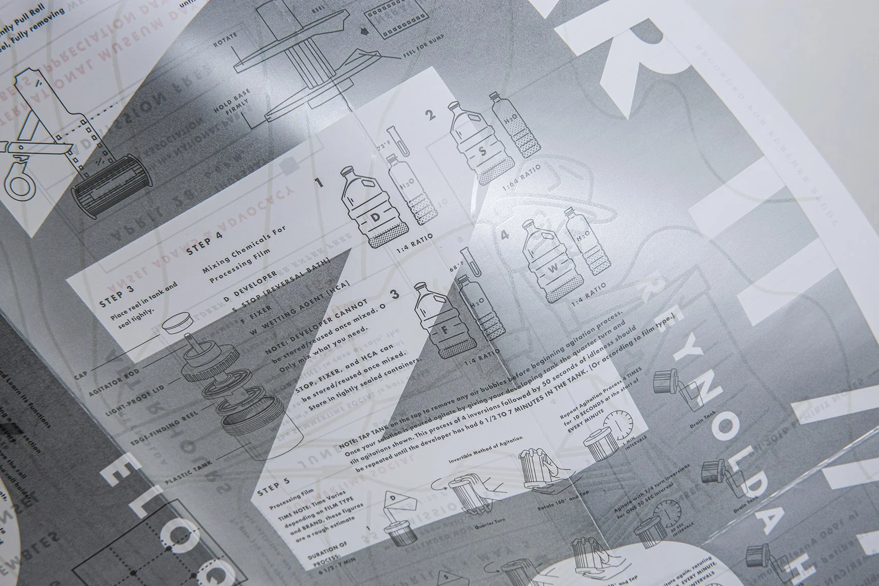
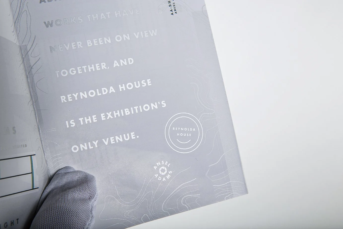
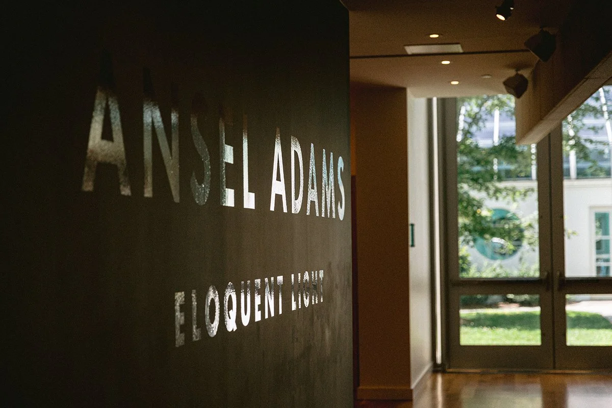
The wall installation carried this into space through chrome reflective vinyl, surfaces that shifted and caught light as viewers moved through the room.
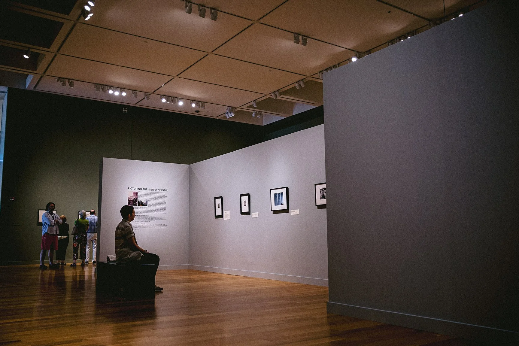
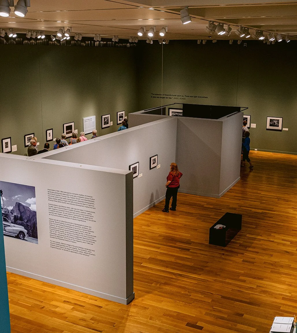
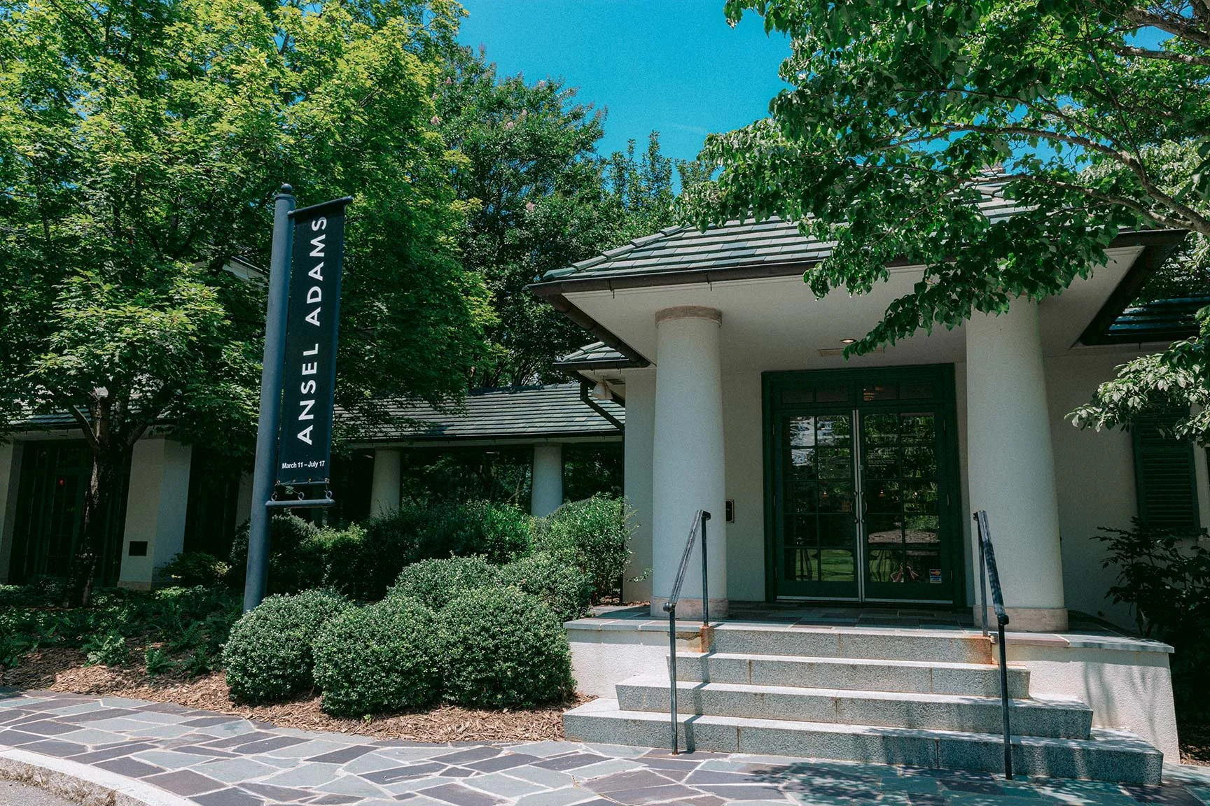
Deliverables
Logo and Identity System
Wall Installation
Fold-out Brochure & Poster
Custom Merch
Web and Digital Elements
Awards
Recognized with first place by the American Alliance of Museums in Exhibition Collateral Materials
Featured in Communication Arts Exhibit
Featured in Communication Arts Typography Annual.
Outcome
The exhibition drew over 34,000 visitors, broke Reynolda House attendance and store revenue records, and generated nationwide media coverage — becoming one of the most successful exhibitions in the museum's history.
"The intricacies with which the design supported the exhibition were truly a delight to discover and share."