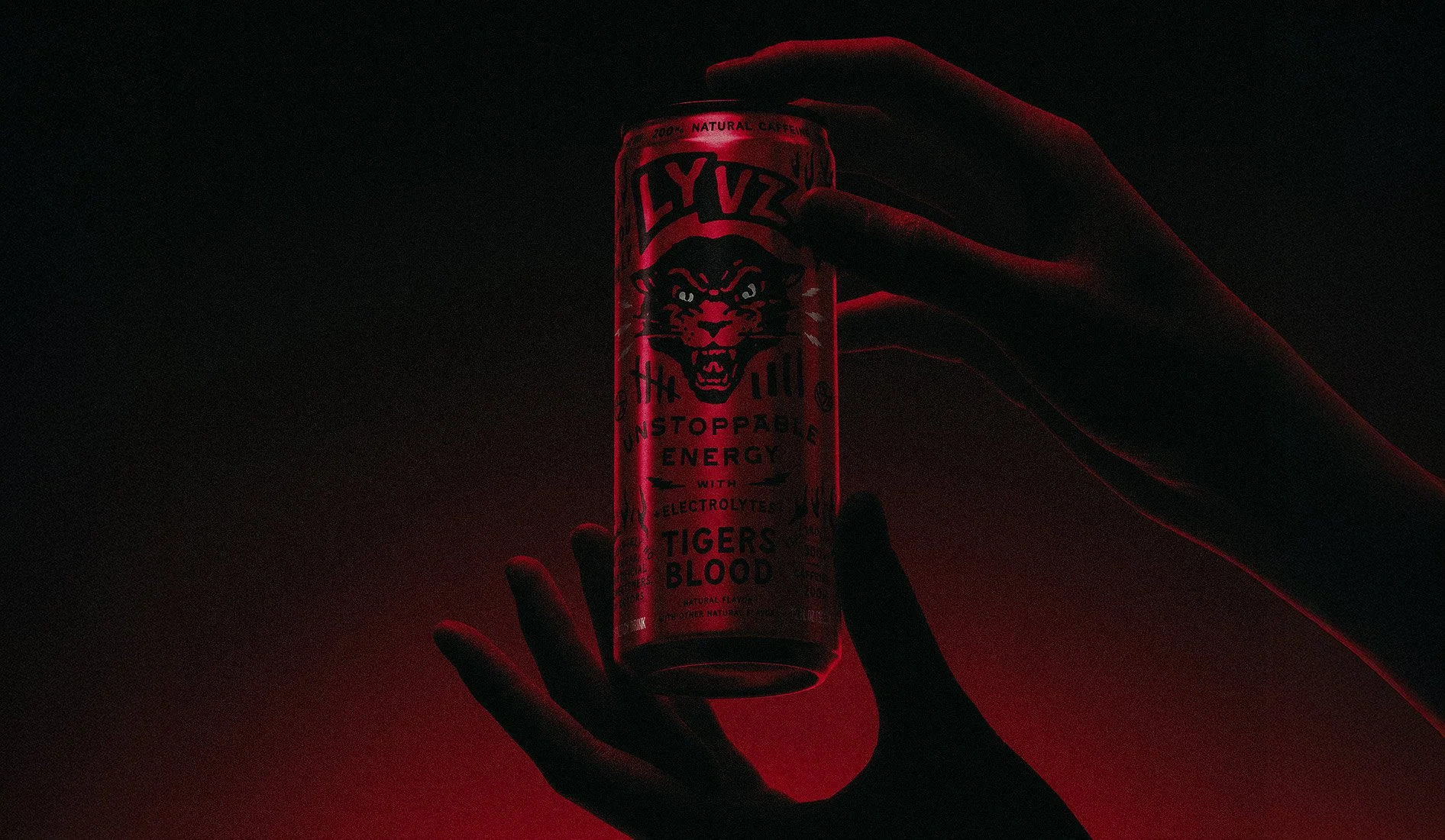
LYVZ ENERGY
A STRATEGY BUILT ON CONVICTION, NOT COMPROMISE
LYVZ ENERGY ISN'T INTERESTED IN FITTING IN. BUILT ON CLEAN INGREDIENTS, 300MG OF ELECTROLYTES, AND ABSOLUTELY NO ARTIFICIAL SWEETENERS OR JUNK, THE PRODUCT WAS ALREADY BREAKING THE RULES OF ITS CATEGORY BEFORE THE BRAND EXISTED. MY JOB WAS TO MAKE SURE THE BRAND BROKE THEM TOO. WHAT FOLLOWED WAS A FULL CREATIVE BUILDOUT — STRATEGY, IDENTITY, PACKAGING, DIGITAL, MOTION AND EVERYTHING IN BETWEEN — ANCHORED BY A SINGLE BELIEF: PEOPLE DON'T FOLLOW PRODUCTS, THEY FOLLOW CULTURES. LYVZ NEEDED TO BE ONE WORTH FOLLOWING.
THE CHALLENGE
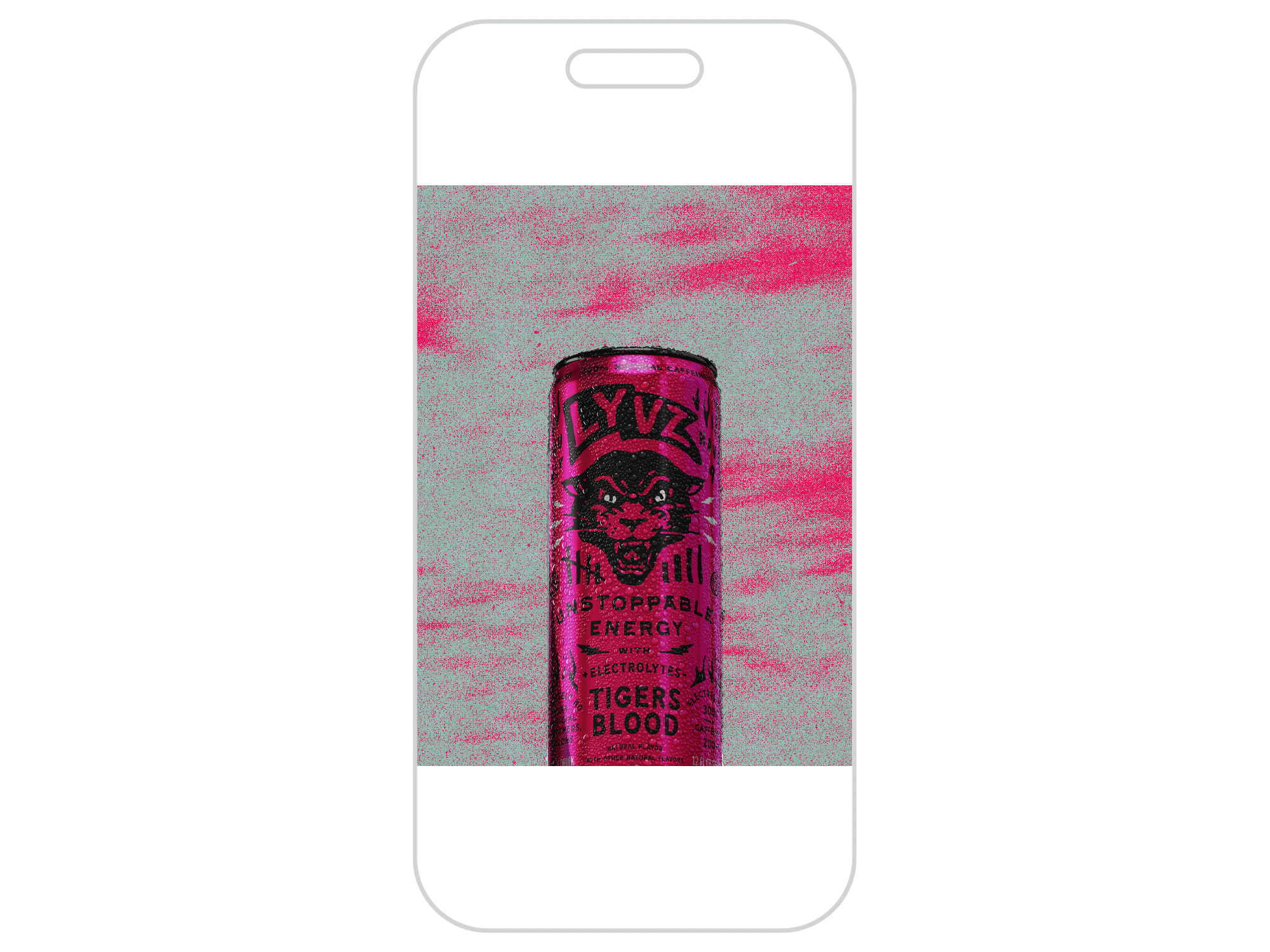
LYVZ ENERGY ENTERED THE MARKET WITH SOMETHING GENUINELY DIFFERENT — A CLEAN-FORMULA ENERGY DRINK BUILT ON NATURAL INGREDIENTS, FREE OF ARTIFICIAL AND REFINED SUGARS, AND LOADED WITH 300MG OF ELECTROLYTES, A RARITY IN A CATEGORY DEFINED BY SUGAR CRASHES AND SYNTHETIC ADDITIVES. THE PRODUCT REFUSED TO COMPROMISE. THE BRAND HAD TO MATCH THAT CONVICTION.
THE CHALLENGE WAS NOT SIMPLY HOW TO MARKET A HEALTHIER ENERGY DRINK. IT WAS BIGGER THAN THAT: HOW DO YOU BUILD RELEVANCE WITH A BROAD AUDIENCE WITHOUT GETTING TRAPPED IN THE NARROW, OFTEN ALIENATING LANGUAGE OF "HEALTH" CULTURE? HOW DO YOU MAKE SOMETHING THAT'S GOOD FOR YOU FEEL GENUINELY COOL — NOT AS A TREND, BUT AS A WAY OF LIFE?

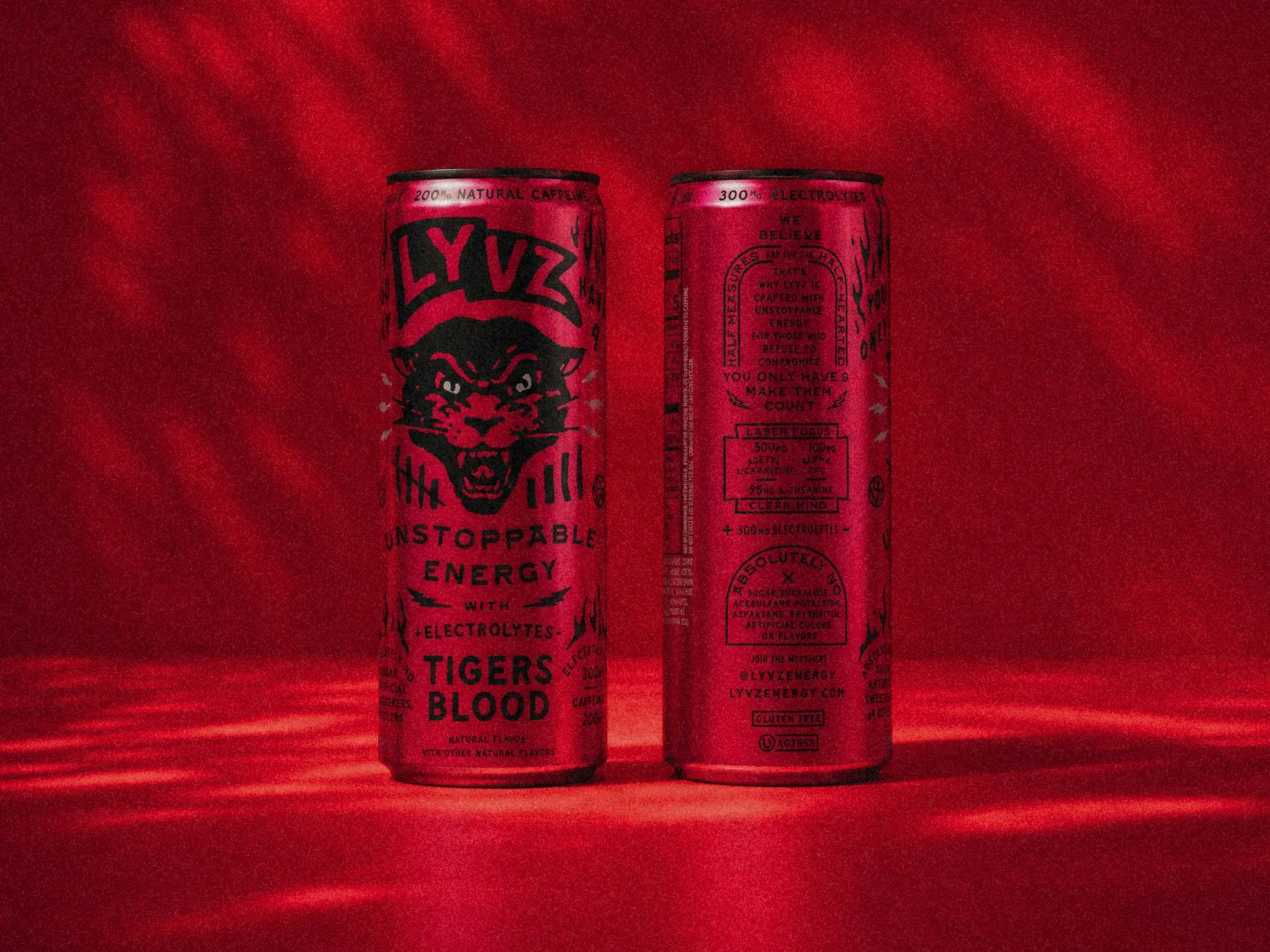
The strategy was not to build a health brand, but a lifestyle brand.

People don’t follow products, they follow cultures. Rather than leading with ingredient lists and wellness claims, the brand needed to stand for something – a mindset, an attitutde, a way of moving through the world.
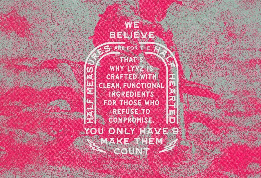
We defined LYVZ as the rebel. Unwilling to conform to the artificial standards of an entire industry. LYVZ wasn’t what was already cool, it was defining it. This strategic foundation became the filter for every creative decision going forward.
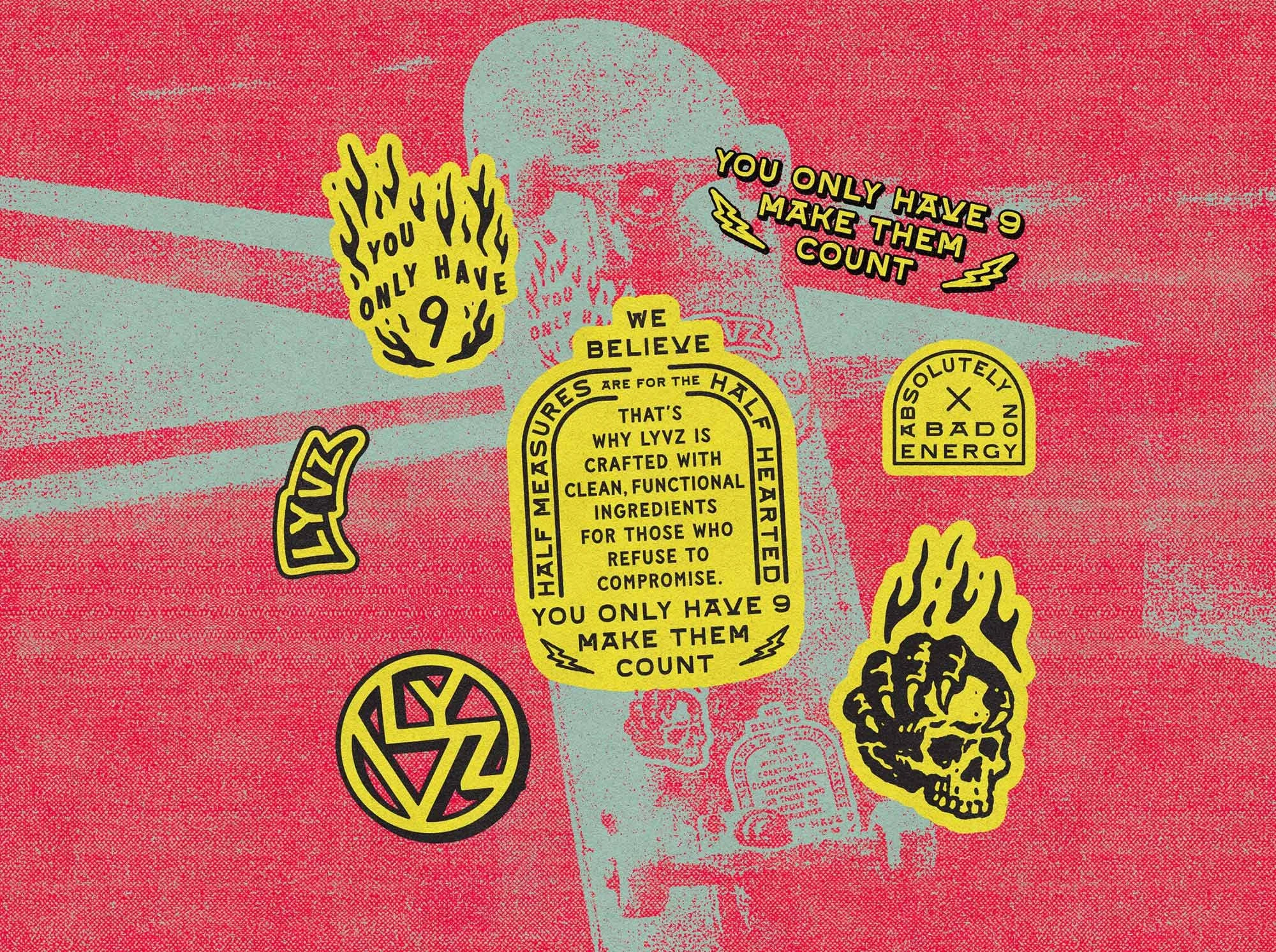
If it felt safe, it wasn’t right.
The Creative Direction
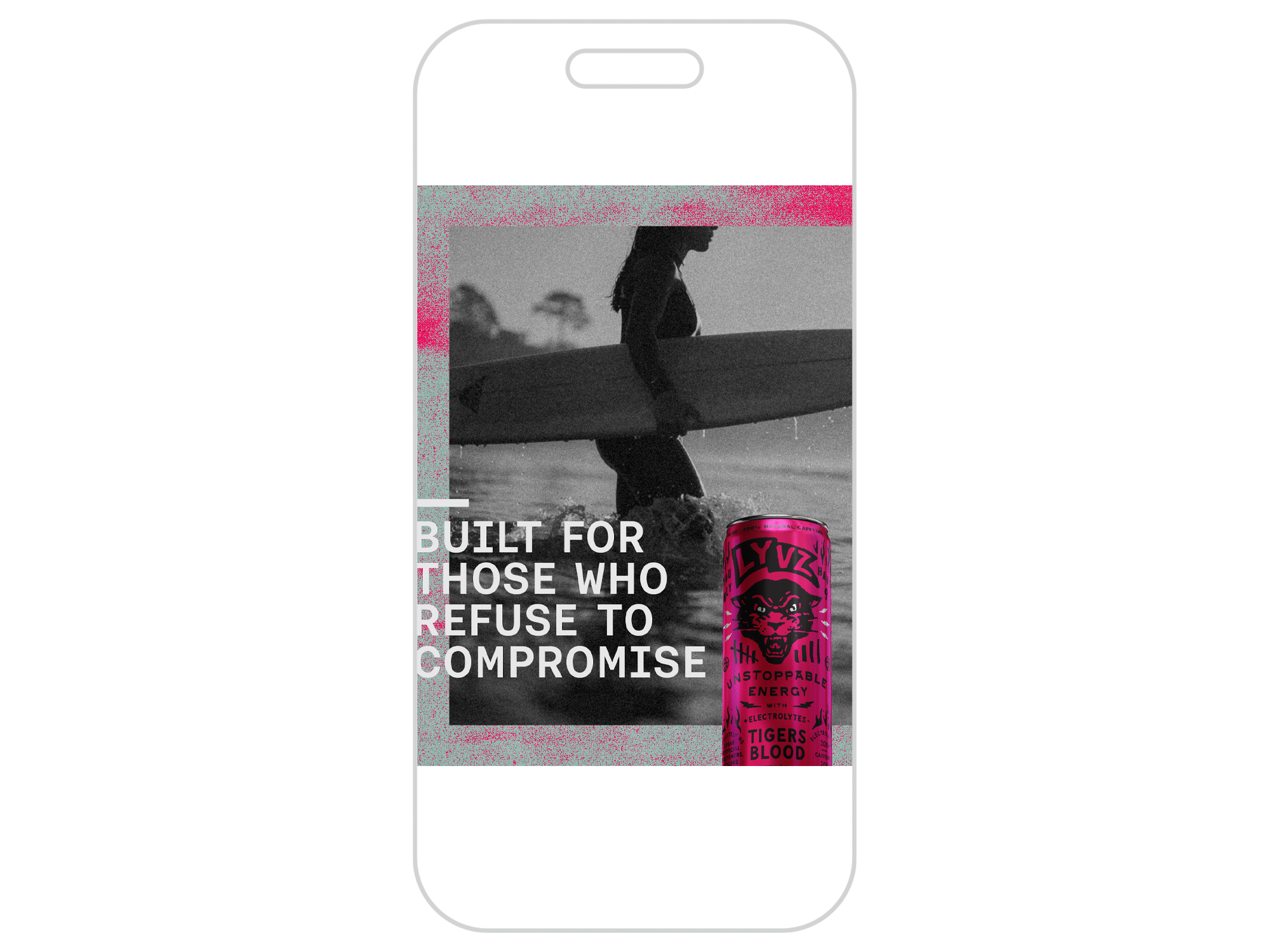
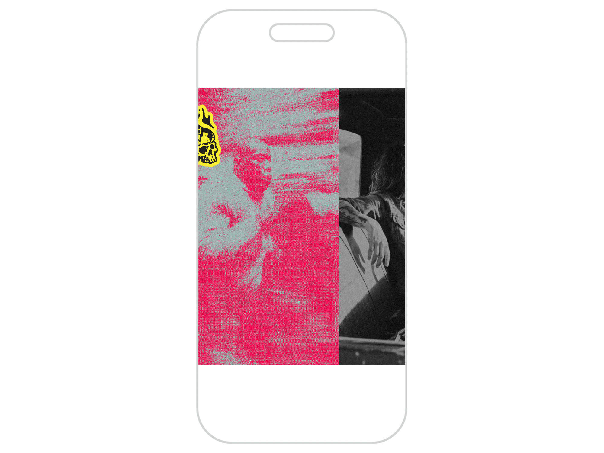
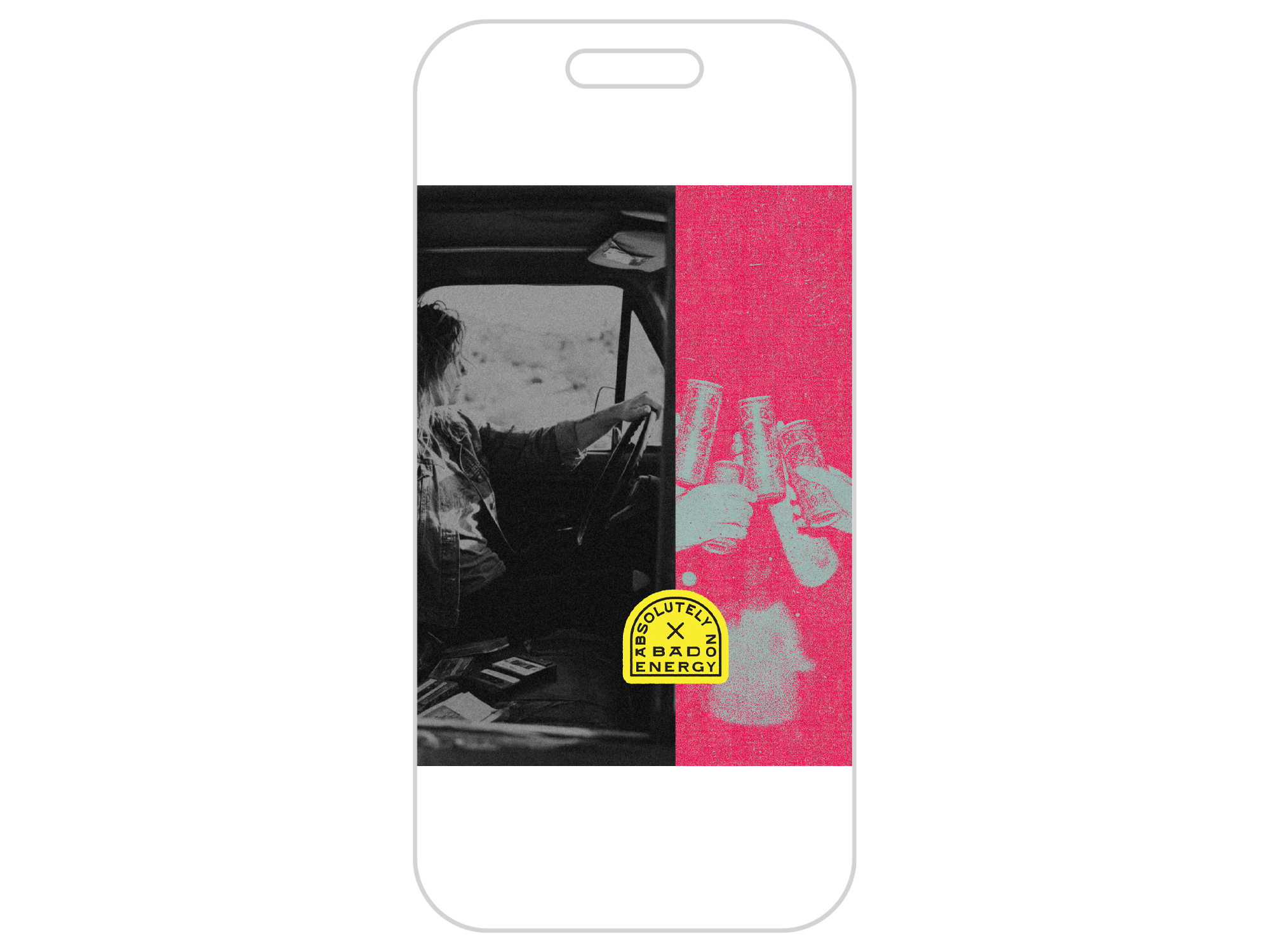
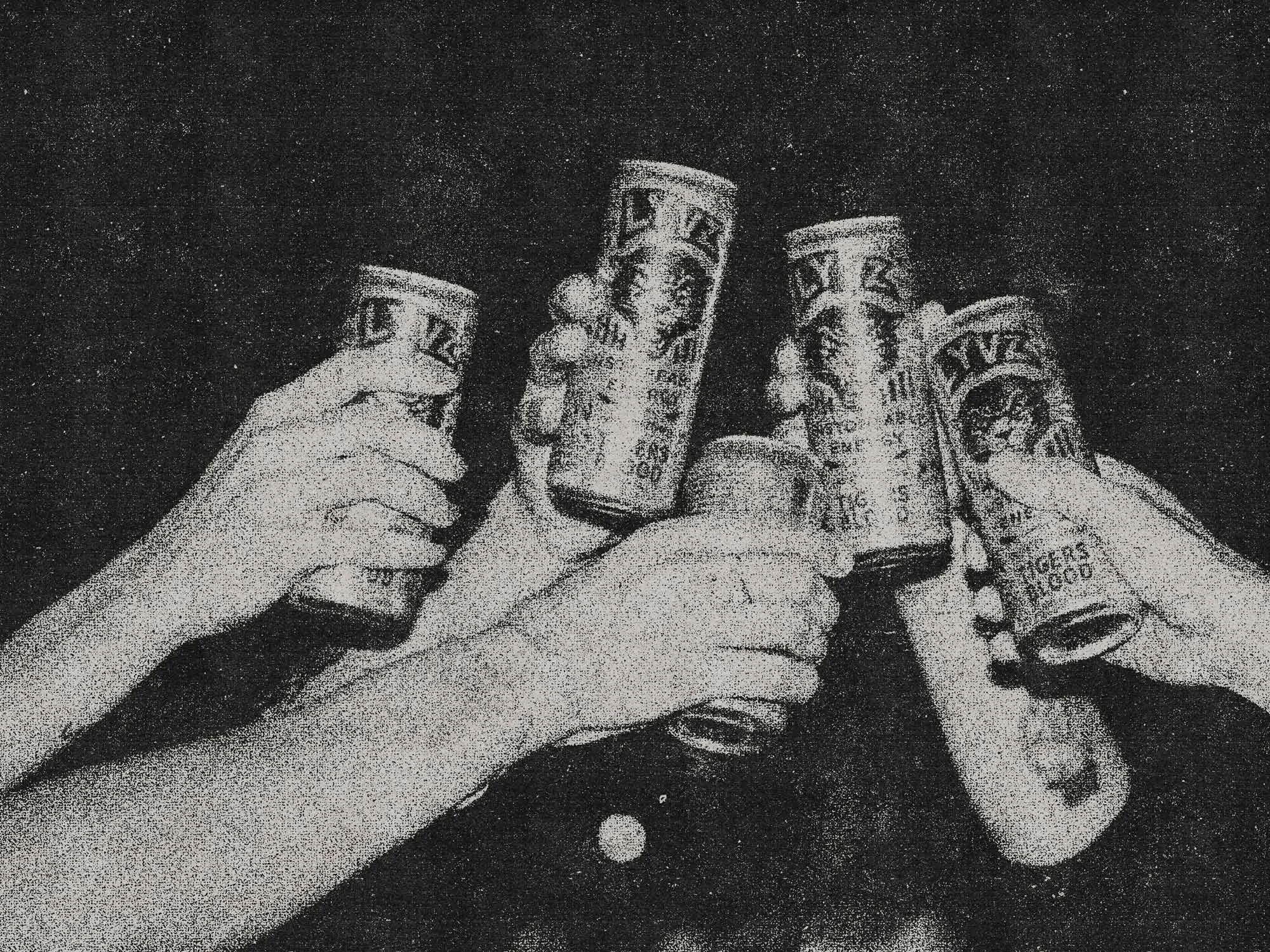
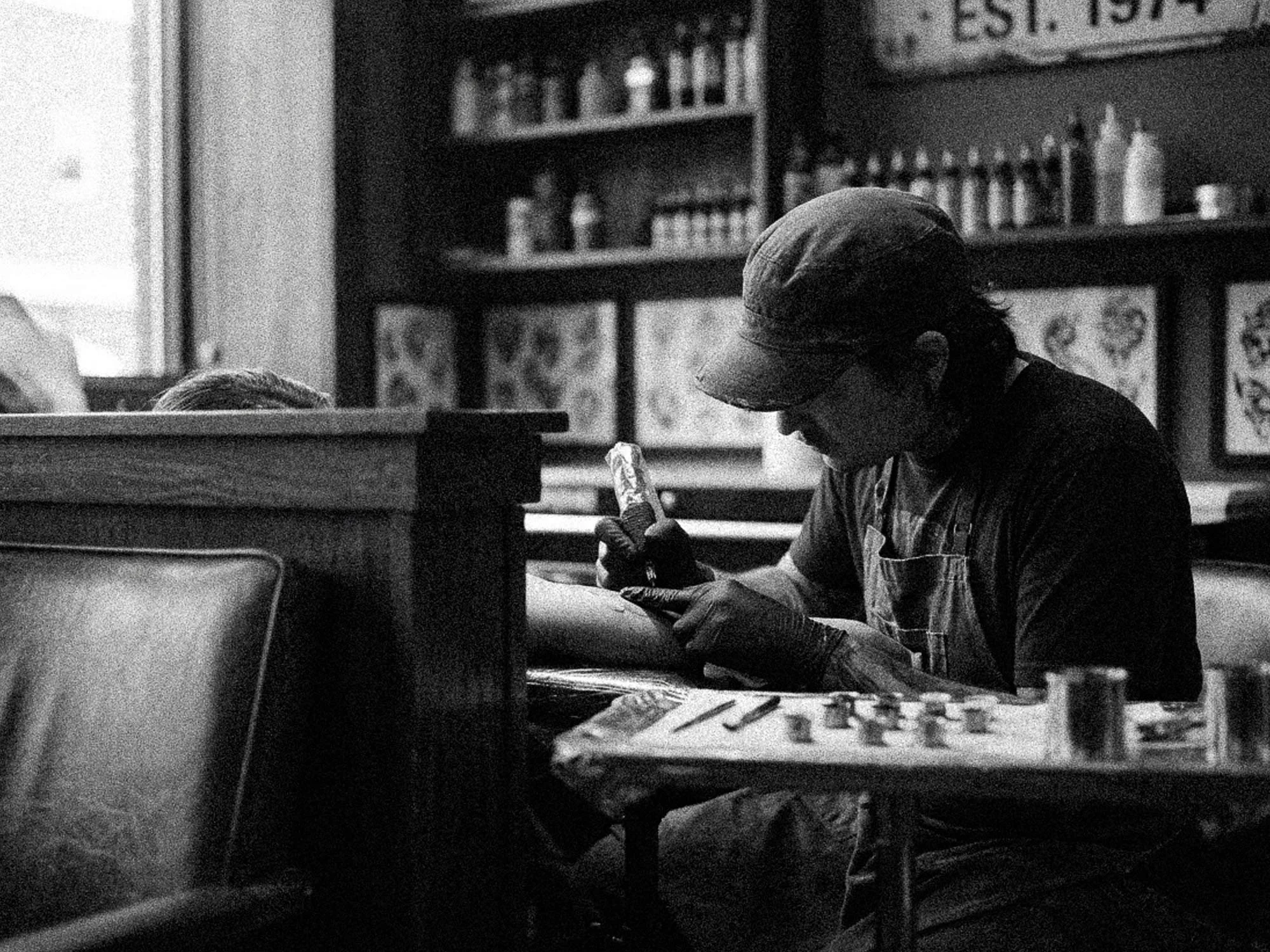
With the rebel archetype established, the visual and verbal language had to earn it. The work took on a bold, tattoo-influenced aesthetic — raw, expressive, and unapologetic. The brand was positioned alongside the cultures that embody risk and full-tilt living: surfing, moto racing, skateboarding. These aren't passive pursuits. They're commitments to showing up, getting after it, and accepting the cost.
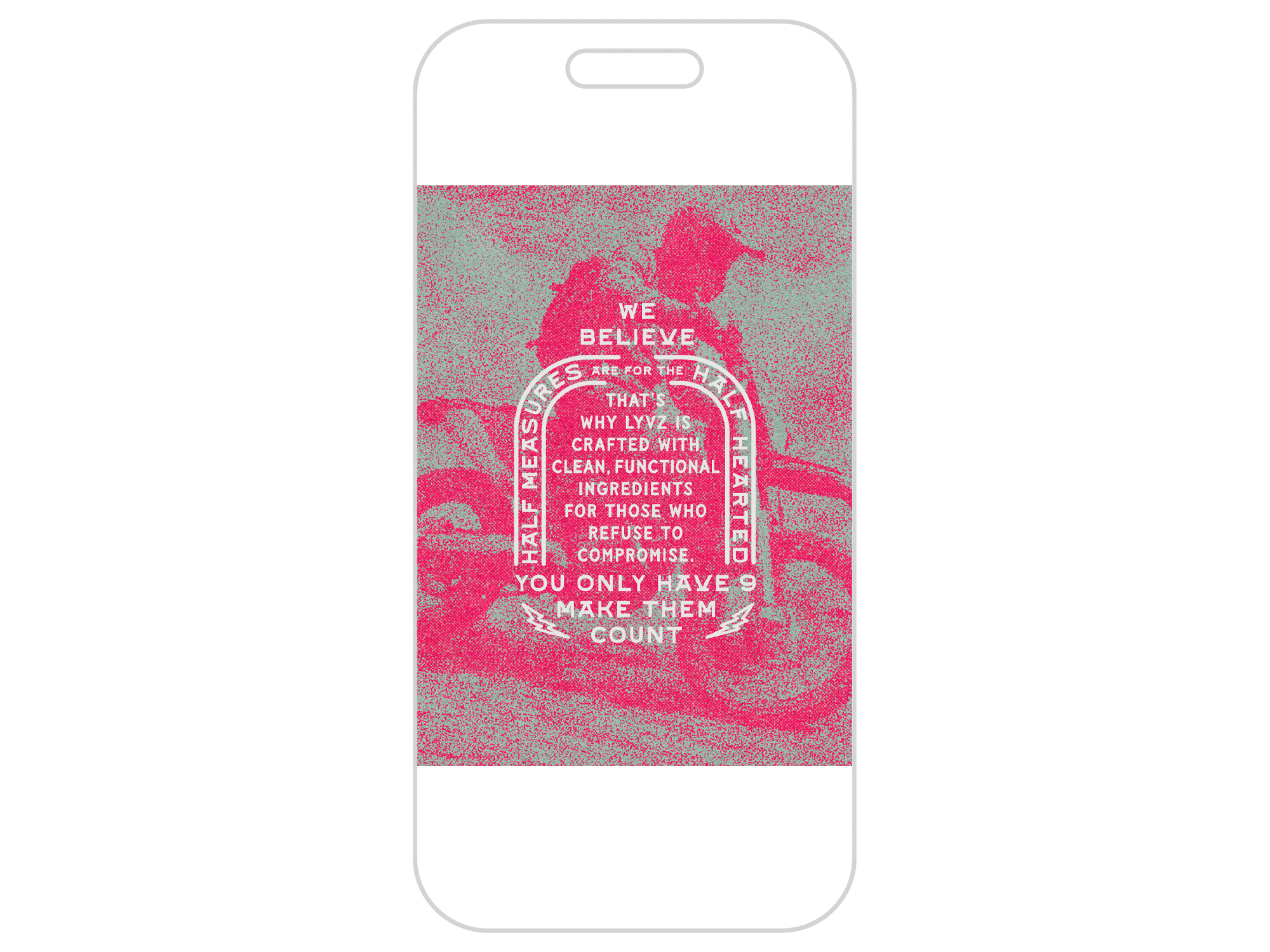
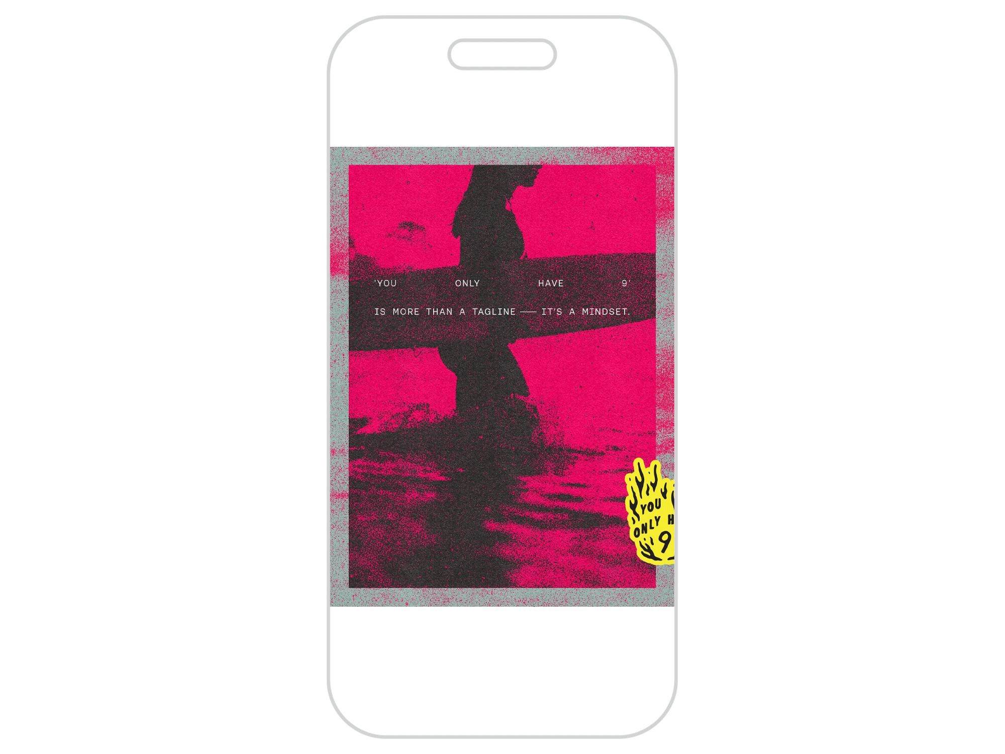
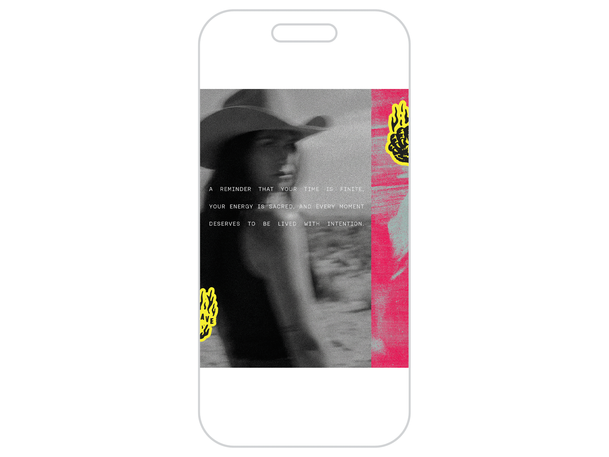
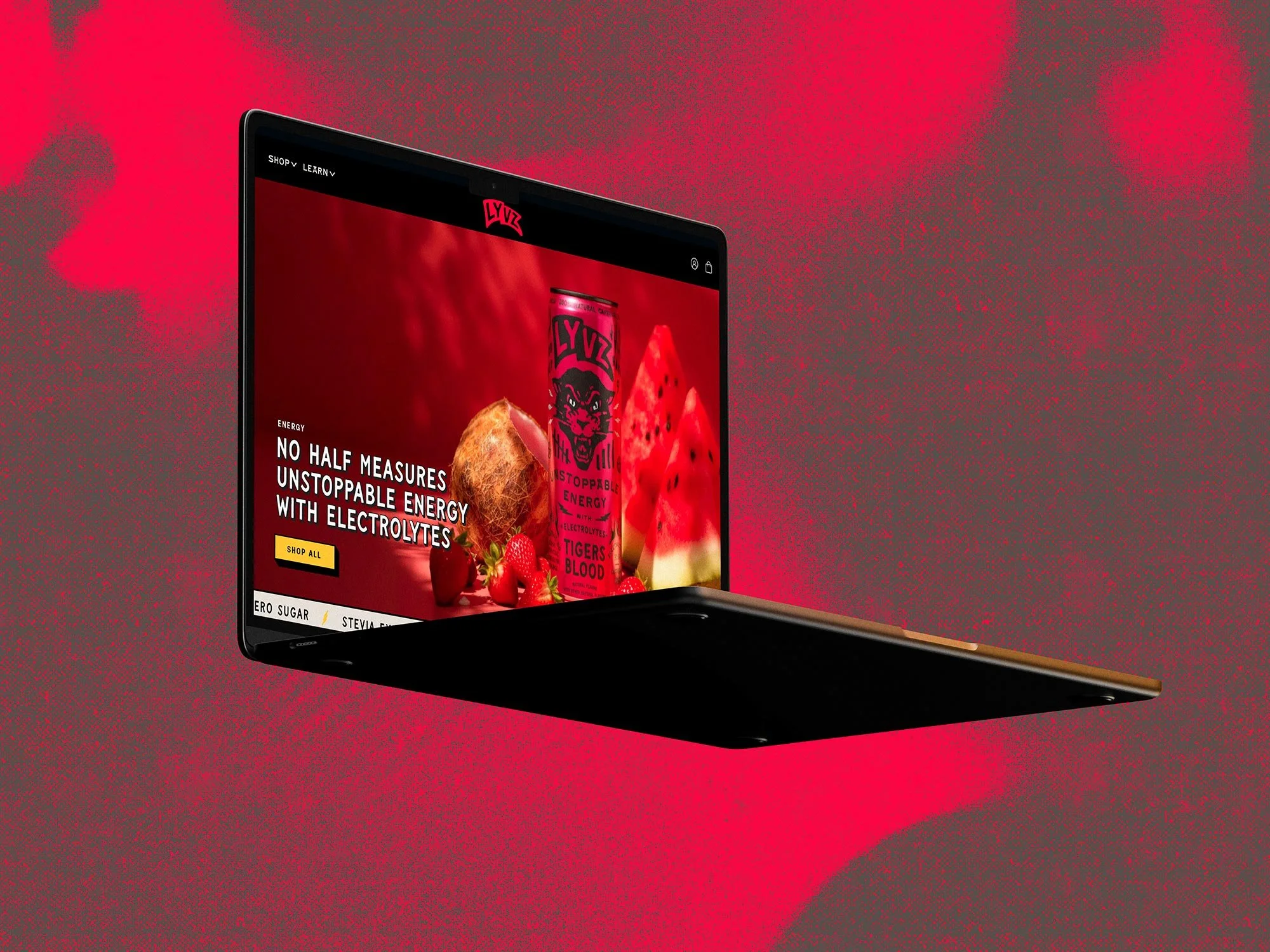
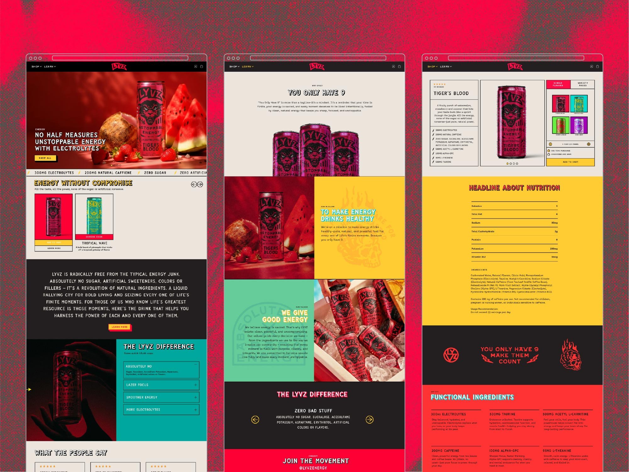
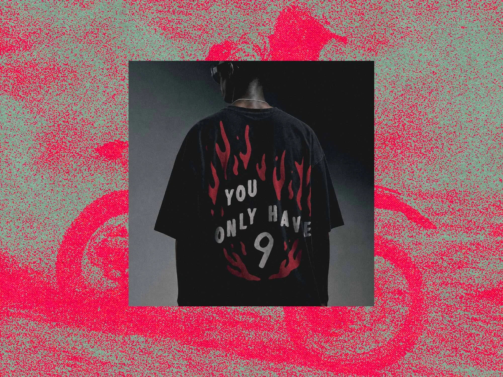
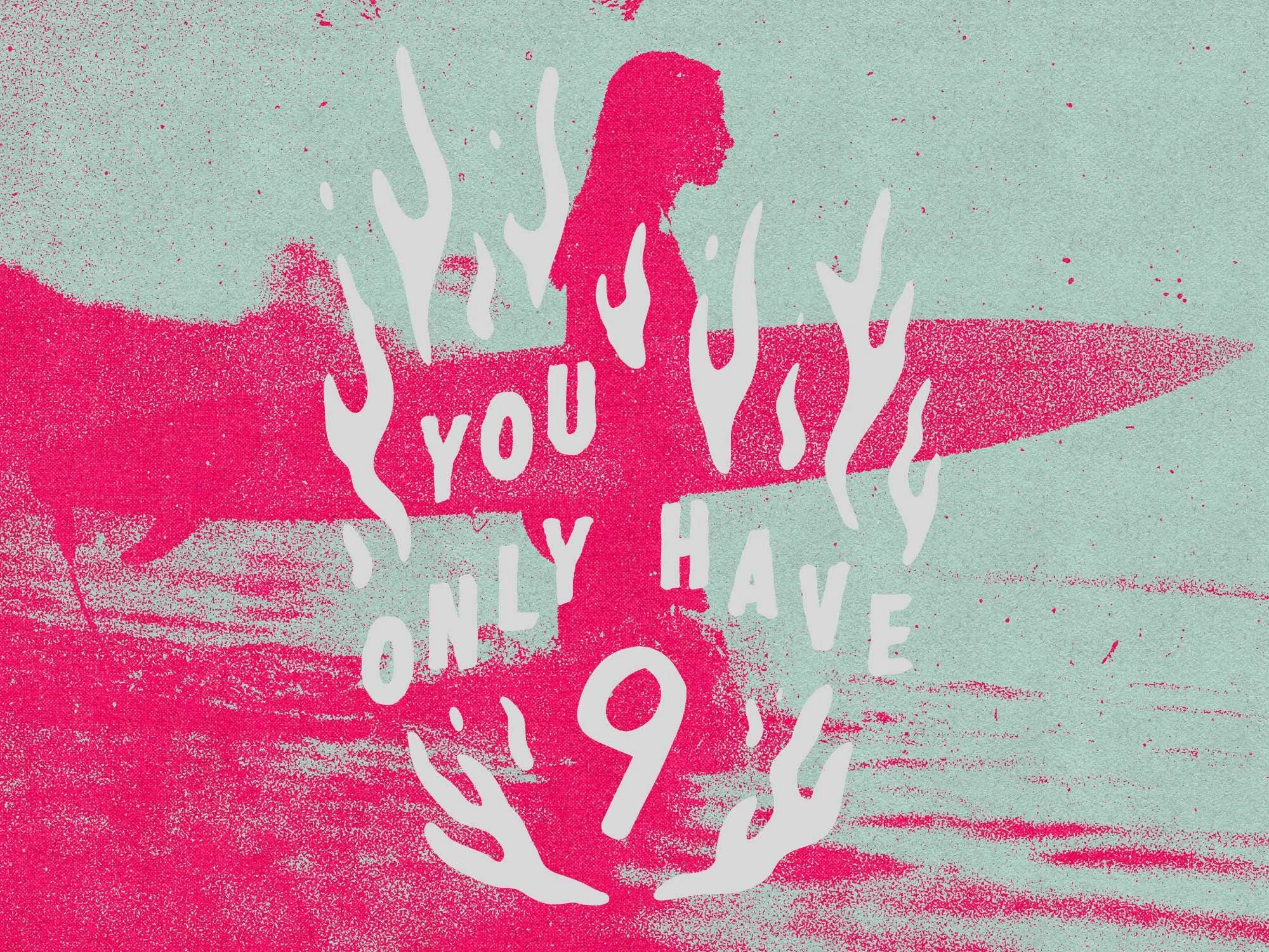
Central to the brand's identity is the line: "You Only Have 9."
What began as a nod to the nine-lives mythology evolved into something far more resonant. The line became a full brand philosophy — a reminder that time is finite, moments are limited, and the only way to honor that is to live them fully. "You Only Have 9" isn't just a tagline. It's a mindset that the brand asks its audience to adopt.
The Mark
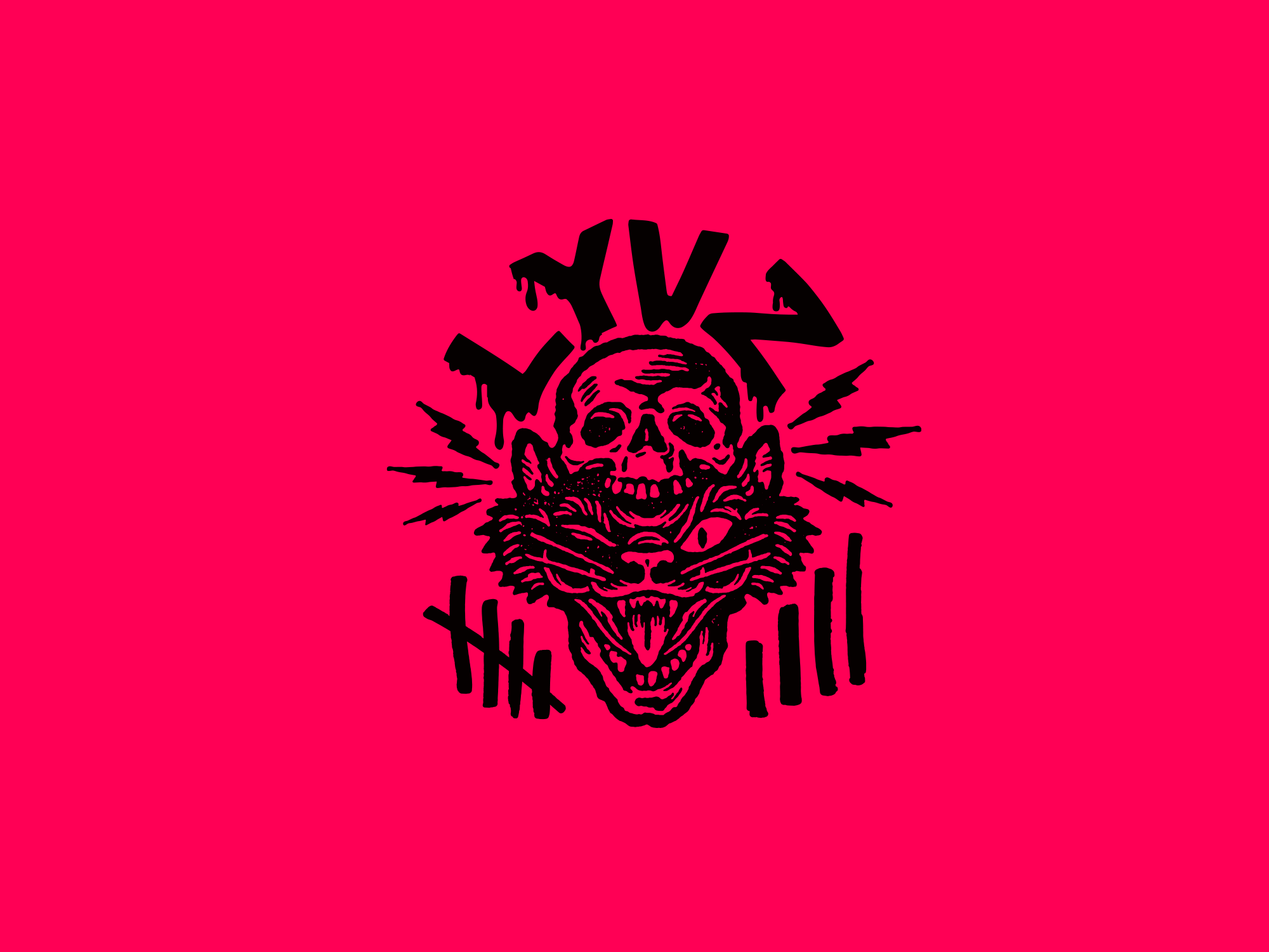
Early explorations used a cat as the brand mark — a natural companion to the "9 lives" concept. But as the creative direction sharpened, the cat fell short. It didn't carry the weight of what LYVZ was becoming.
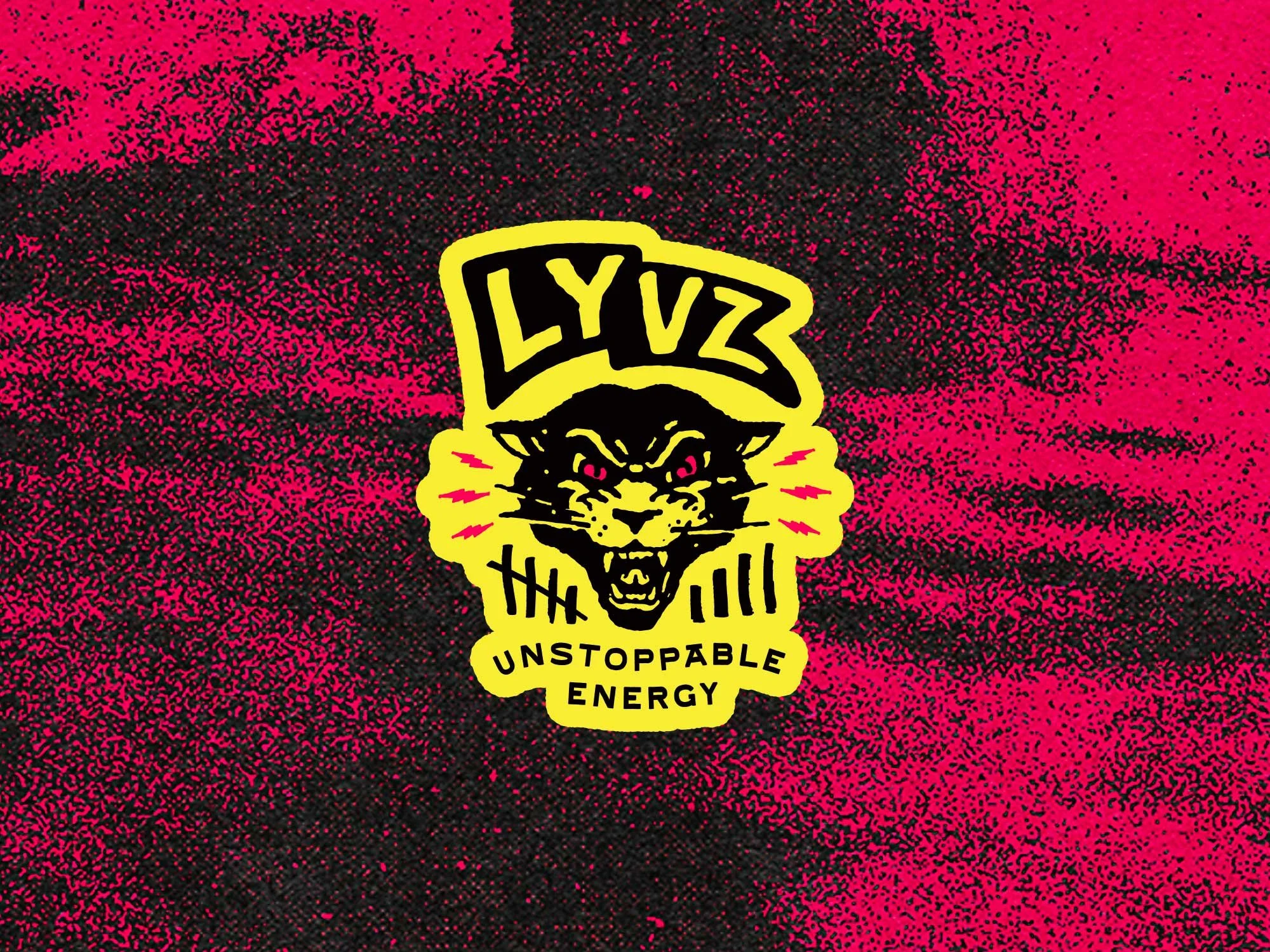
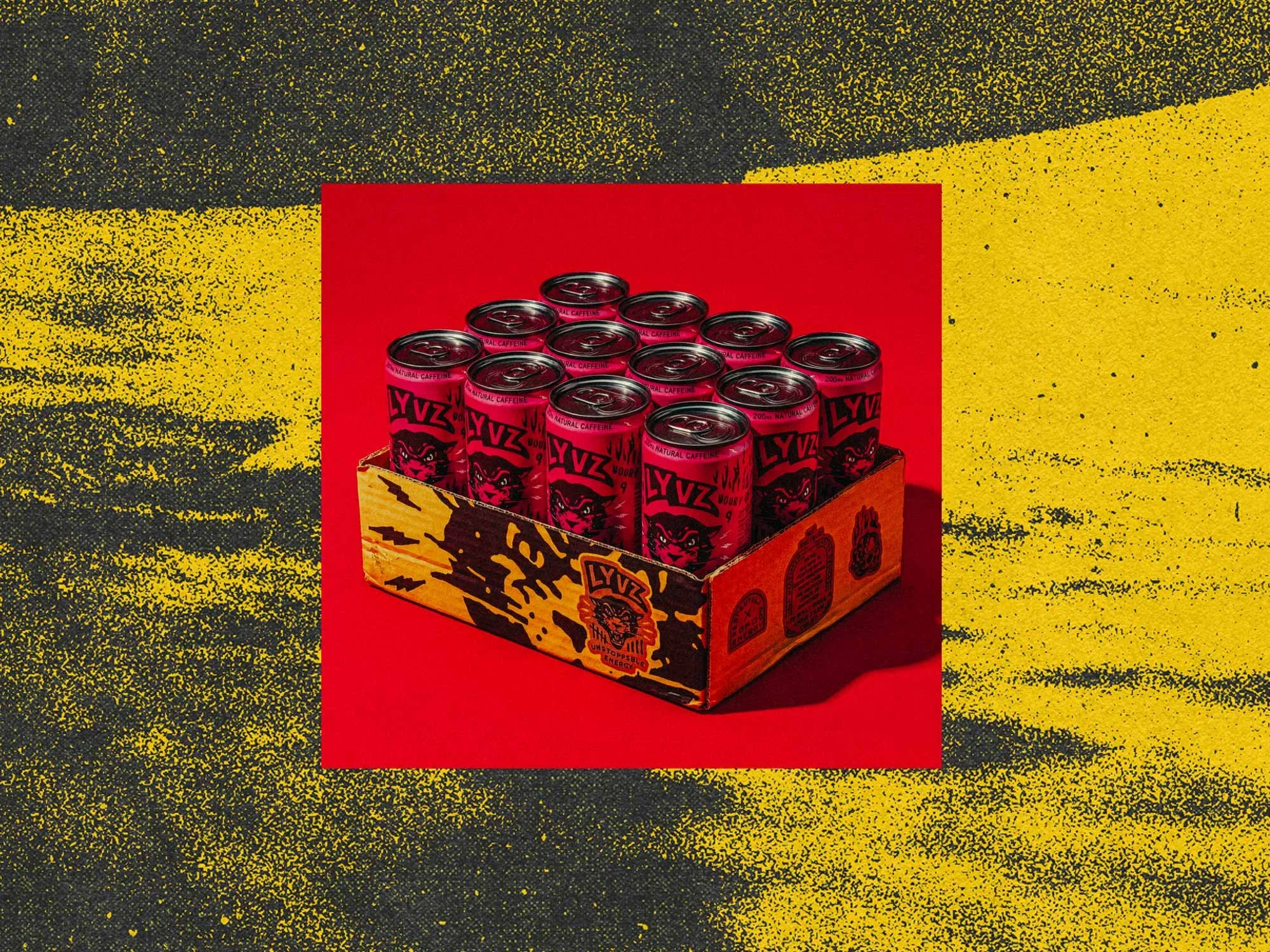
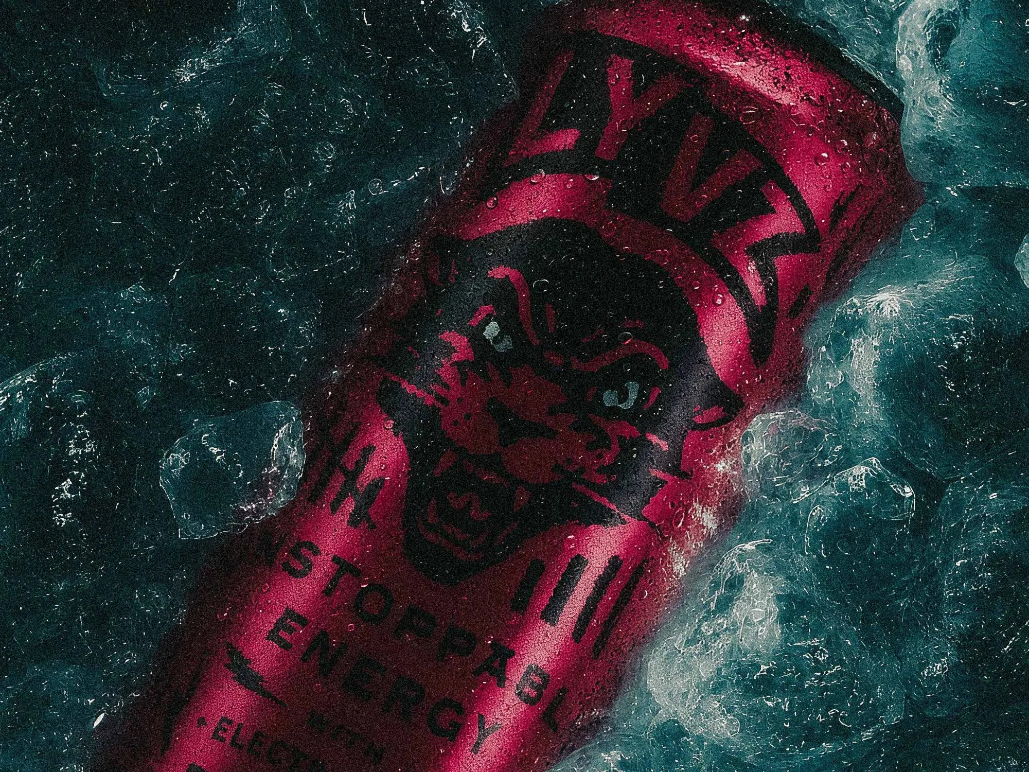
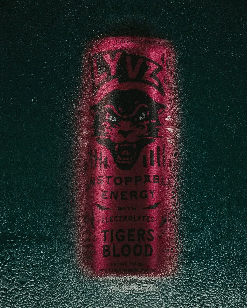
The icon evolved into a panther — a symbol of strength, controlled power, and primal confidence. It retained the 9-lives sentiment while projecting the force the brand demanded.
The logo itself carries a quiet story. Shaped as a banner flag, it holds a subtle nod to carrying something into battle — a cause worth fighting for. The symbolism is embedded, not displayed. Some will see it immediately. Others never will. The best brand details don't demand to be understood — they reward the people who look closely enough to find them.
Teaser Campaign
The brand needed to make noise before it had a voice. A series of teaser spots — 15, 30, and 45-second cuts built for social — were concepted, directed, filmed, and edited to seed the culture before the product ever hit shelves. Not product reveals. Provocations. Carefully crafted glimpses into the world LYVZ was building, designed to make people lean in before they had any answers.
The Unseen Grind
The Ride is the Reward
Sweat Equity




The Outcome
LYVZ launched with a brand identity that resonated immediately. The response from consumers, retailers, and partners has been enthusiastic — with the creative work playing a direct role in helping the client secure conversations with venture partners and establish placements with local and regional retailers.
The brand is still in its early stages, but the foundation is built to scale. As new products come to market, the visual system, packaging architecture, and brand language are all designed to grow with it. The client is planning future product releases, and the creative platform is ready to support them.
What was built for LYVZ isn't just a brand. It's a culture with a point of view — bold enough to stand out, strong enough to last.
Deliverables
Strategy + Positioning
Visual Identity
Verbal Identity
Packaging Design
Sales Collateral
Shipping Containers
Website + E-commerce
Social Media
Merchandise
Photography